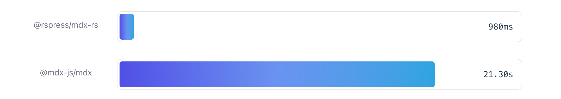
 At the same time, Rspress internally also applies many other build optimization methods, such as `pre-bundle of theme`, etc. These additional optimization methods, combined with the powerful Rust front-end toolchain, push the compilation performance of the SSG framework to a new height.
### MDX support
In order to ensure the flexibility of content development, Rspress chooses to support the MDX content format.
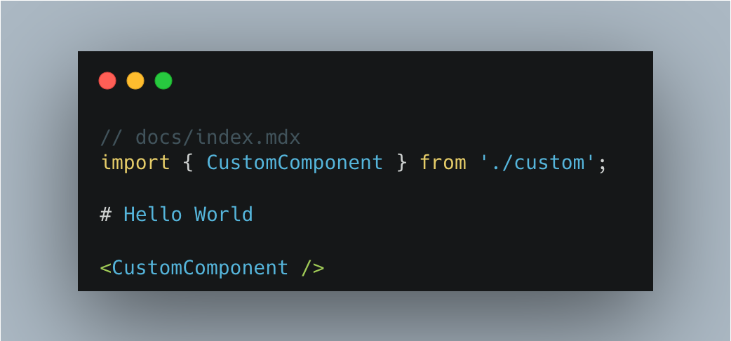
MDX represents a method of componentized content organization. In other words, documents serve as components, allowing for the reuse of document fragments across different documents. Additionally, custom React components can be incorporated into documents, significantly enhancing the flexibility of document development.
### Basic capabilities of documentation site
Of course, Rspress has also done a lot of work on the polishing of the basic capabilities of the documentation site, supporting the following functional features:
- Automatically generate layouts, including navigation bars, left sidebars, etc.
- Static site generation, HTML is directly output after production build.
- Internationalization, support for multi-language documents.
- Full-text search, provide out-of-the-box search function.
- Multi-version document management.
- Custom document theme.
- Automatically generate component Demo preview and playground.
In the following text, we will introduce these functional features in detail.
### Extension mechanism
Rspress internally designed various extension mechanisms to ensure sufficient customization capabilities, including:
- Support for custom global components, global styles, page layout structure, please refer to [Custom Page](/guide/basic/custom-page).
- Support **build extension**, including custom Rspack config, adding MDX compilation plugins, etc., please refer to [Build Extension](/guide/advanced/extend-build).
- Support **custom theme**, please refer to [Custom Theme](/ui/custom-theme).
- Built-in **plugin system**, support for custom plugins, please refer to [Plugin System](/plugin/system/introduction).
## Features
Next, let's introduce the main functional features of Rspress.
### Automatic layout generation
For the construction of a documentation site, in addition to displaying the main content, we generally need the following layout modules:
- Navigation bar, used to provide global navigation entrance.
- Sidebar, used to display the article directory under the current navigation.
- Article outline column, used to display the outline structure of the current page.
For the document outline, Rspress will automatically extract the various titles in the document, generate outline information, and display it on the right side of the article page by default, without any other operations.
For the navigation bar and sidebar, we provide two config methods, you can choose one of them:
- **Declarative config**. Configure the corresponding data by declaring `_meta.json` in the directory, such as:
```json title="_meta.json"
["introduction", "install", "start"]
```
You can read the [Auto Nav/Sidebar](/guide/basic/auto-nav-sidebar) for config details.
- **Programming config**. Implement it by specifying the [nav](/api/config/config-theme.html#nav) and [sidebar](/api/config/config-theme.html#sidebar) config items in the Rspress config.
We recommend using `declarative config` under normal scenes, which has many benefits:
1. Make config file is more concise and clear.
2. The correspondence between the `file directory structure` and the `sidebar directory structure` is more intuitive.
3. When adding or deleting a sidebar directory, operate directly in the current directory, instead of going to the `rspress.config.ts` config file to locate the corresponding position and then add/delete the config, thereby reducing the cost of switching development context.
The `programming config` is very useful in some scenarios where dynamic config generation is needed. For example, the official Rspress [TypeDoc plugin](/plugin/official-plugins/typedoc) will automatically convert a json data provided by TypeDoc into `nav` and `sidebar` configs.
### MDX support
MDX is a powerful content development format. You can not only write Markdown files as usual, but also use React components in the content of Markdown:
At the same time, Rspress internally also applies many other build optimization methods, such as `pre-bundle of theme`, etc. These additional optimization methods, combined with the powerful Rust front-end toolchain, push the compilation performance of the SSG framework to a new height.
### MDX support
In order to ensure the flexibility of content development, Rspress chooses to support the MDX content format.
MDX represents a method of componentized content organization. In other words, documents serve as components, allowing for the reuse of document fragments across different documents. Additionally, custom React components can be incorporated into documents, significantly enhancing the flexibility of document development.
### Basic capabilities of documentation site
Of course, Rspress has also done a lot of work on the polishing of the basic capabilities of the documentation site, supporting the following functional features:
- Automatically generate layouts, including navigation bars, left sidebars, etc.
- Static site generation, HTML is directly output after production build.
- Internationalization, support for multi-language documents.
- Full-text search, provide out-of-the-box search function.
- Multi-version document management.
- Custom document theme.
- Automatically generate component Demo preview and playground.
In the following text, we will introduce these functional features in detail.
### Extension mechanism
Rspress internally designed various extension mechanisms to ensure sufficient customization capabilities, including:
- Support for custom global components, global styles, page layout structure, please refer to [Custom Page](/guide/basic/custom-page).
- Support **build extension**, including custom Rspack config, adding MDX compilation plugins, etc., please refer to [Build Extension](/guide/advanced/extend-build).
- Support **custom theme**, please refer to [Custom Theme](/ui/custom-theme).
- Built-in **plugin system**, support for custom plugins, please refer to [Plugin System](/plugin/system/introduction).
## Features
Next, let's introduce the main functional features of Rspress.
### Automatic layout generation
For the construction of a documentation site, in addition to displaying the main content, we generally need the following layout modules:
- Navigation bar, used to provide global navigation entrance.
- Sidebar, used to display the article directory under the current navigation.
- Article outline column, used to display the outline structure of the current page.
For the document outline, Rspress will automatically extract the various titles in the document, generate outline information, and display it on the right side of the article page by default, without any other operations.
For the navigation bar and sidebar, we provide two config methods, you can choose one of them:
- **Declarative config**. Configure the corresponding data by declaring `_meta.json` in the directory, such as:
```json title="_meta.json"
["introduction", "install", "start"]
```
You can read the [Auto Nav/Sidebar](/guide/basic/auto-nav-sidebar) for config details.
- **Programming config**. Implement it by specifying the [nav](/api/config/config-theme.html#nav) and [sidebar](/api/config/config-theme.html#sidebar) config items in the Rspress config.
We recommend using `declarative config` under normal scenes, which has many benefits:
1. Make config file is more concise and clear.
2. The correspondence between the `file directory structure` and the `sidebar directory structure` is more intuitive.
3. When adding or deleting a sidebar directory, operate directly in the current directory, instead of going to the `rspress.config.ts` config file to locate the corresponding position and then add/delete the config, thereby reducing the cost of switching development context.
The `programming config` is very useful in some scenarios where dynamic config generation is needed. For example, the official Rspress [TypeDoc plugin](/plugin/official-plugins/typedoc) will automatically convert a json data provided by TypeDoc into `nav` and `sidebar` configs.
### MDX support
MDX is a powerful content development format. You can not only write Markdown files as usual, but also use React components in the content of Markdown:
 In addition, Rspress also supports some specific syntax, such as:
- Custom container syntax.
- FrontMatter metadata definition.
- Code line highlighting syntax.
Details can be found in the [Use MDX Document](/guide/use-mdx.html 'Use MDX s').
### SSG
Rspress is a SSG framework. In the build process in the production environment, it will automatically help you generate static sites, that is, generate HTML content for each page. After the build process is completed, HTML will appear in the default output directory.
Then, you can deploy the contents of this product directory to any static site hosting service, such as GitHub Pages, Netlify, Vercel, etc.
At the same time, we also provide config to easily customize the HTML content generated by SSG. For details, please refer to the [Static Site Generation Document](/guide/basic/ssg.html 'Static Site Generation Document').
### Internationalization (I18n)
Internationalization is a common requirement in a document-type site, and Rspress encapsulates the ability of internationalization to be simple and easy to use. In Rspress, we abstract internationalization into the following requirements:
- How to define I18n data source?
- How to configure the site under different languages?
- How to organize the document directory of different language versions?
- How to use I18n data source in custom components?
Rspress has already supported these demand scenarios for you. You can follow the [I18n Tutorial](/guide/default-theme/i18n.html 'I18n Tutorial') to step by step to implement internationalization for your site.
### Multi-version Documents
In some scenarios, we need to manage multi-version documents, and Rspress has built-in support for multi-version documents. On the one hand, you can enable this capability through simple config. On the other hand, you only need to organize the directory as usual, without introducing unnecessary directories and concepts, minimizing the mental burden:
```ts
// config file
import { defineConfig } from '@rspress/core';
export default defineConfig({
multiVersion: {
default: 'v1',
versions: ['v1', 'v2'],
},
});
```
```txt
// Directory structure
docs
├── v1
│ ├── README.md
│ └── guide
│ └── README.md
└── v2
├── README.md
└── guide
```
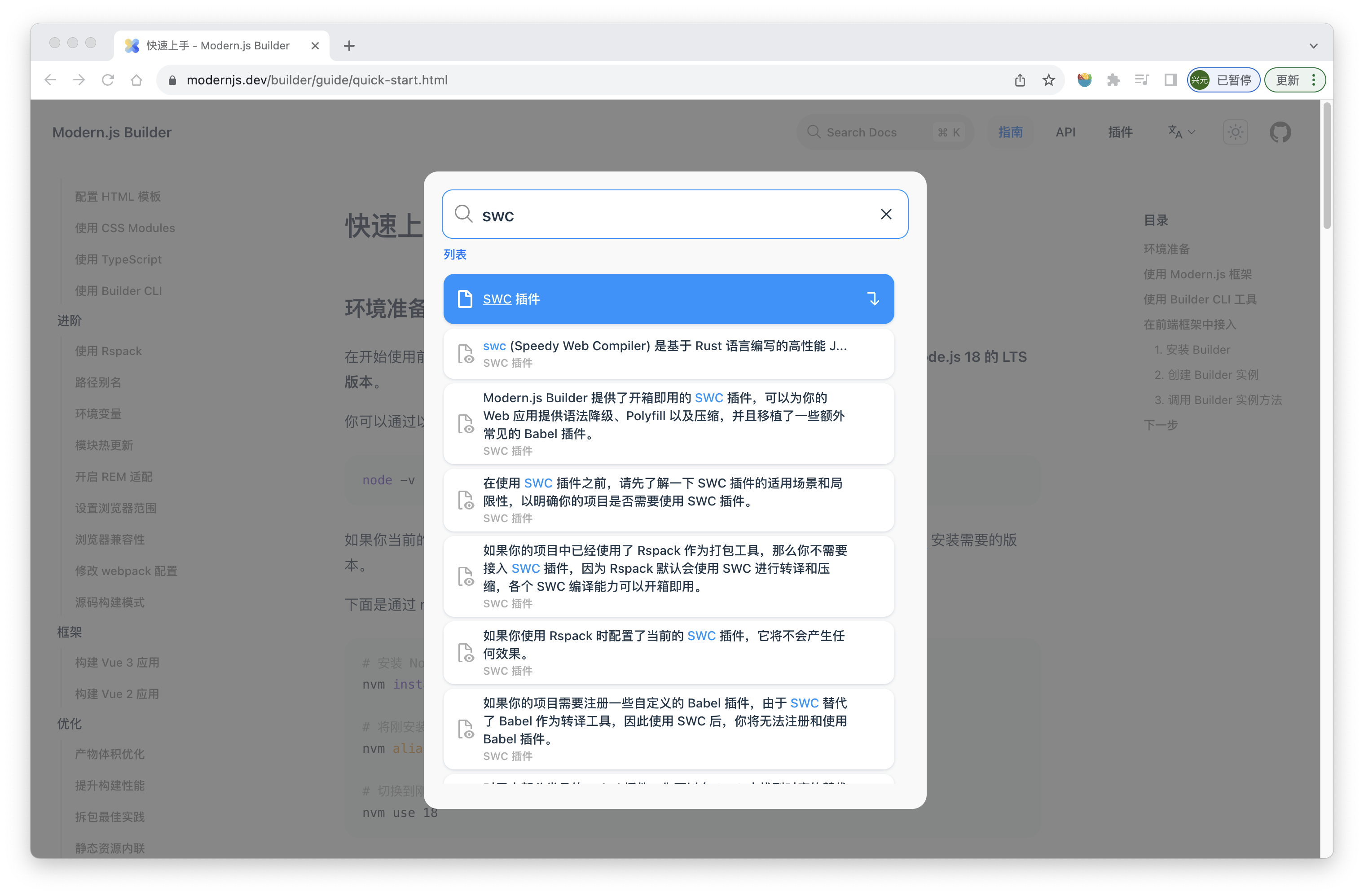
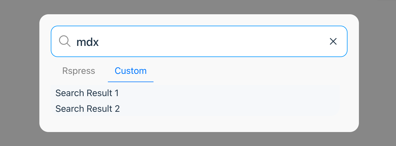
### Full text search
Rspress provides out-of-the-box full-text search capabilities, which you can access without any config. It is based on the open-source FlexSearch engine, with the following effect:
In addition, Rspress also supports some specific syntax, such as:
- Custom container syntax.
- FrontMatter metadata definition.
- Code line highlighting syntax.
Details can be found in the [Use MDX Document](/guide/use-mdx.html 'Use MDX s').
### SSG
Rspress is a SSG framework. In the build process in the production environment, it will automatically help you generate static sites, that is, generate HTML content for each page. After the build process is completed, HTML will appear in the default output directory.
Then, you can deploy the contents of this product directory to any static site hosting service, such as GitHub Pages, Netlify, Vercel, etc.
At the same time, we also provide config to easily customize the HTML content generated by SSG. For details, please refer to the [Static Site Generation Document](/guide/basic/ssg.html 'Static Site Generation Document').
### Internationalization (I18n)
Internationalization is a common requirement in a document-type site, and Rspress encapsulates the ability of internationalization to be simple and easy to use. In Rspress, we abstract internationalization into the following requirements:
- How to define I18n data source?
- How to configure the site under different languages?
- How to organize the document directory of different language versions?
- How to use I18n data source in custom components?
Rspress has already supported these demand scenarios for you. You can follow the [I18n Tutorial](/guide/default-theme/i18n.html 'I18n Tutorial') to step by step to implement internationalization for your site.
### Multi-version Documents
In some scenarios, we need to manage multi-version documents, and Rspress has built-in support for multi-version documents. On the one hand, you can enable this capability through simple config. On the other hand, you only need to organize the directory as usual, without introducing unnecessary directories and concepts, minimizing the mental burden:
```ts
// config file
import { defineConfig } from '@rspress/core';
export default defineConfig({
multiVersion: {
default: 'v1',
versions: ['v1', 'v2'],
},
});
```
```txt
// Directory structure
docs
├── v1
│ ├── README.md
│ └── guide
│ └── README.md
└── v2
├── README.md
└── guide
```
### Full text search
Rspress provides out-of-the-box full-text search capabilities, which you can access without any config. It is based on the open-source FlexSearch engine, with the following effect:
 ### Custom theme
Rspress supports two ways to customize themes:
1. Extend from the default theme. In each component of the default theme, many slots are provided for you to add custom layout content, for example:
```tsx
// theme/index.tsx
import Theme from '@rspress/core/theme';
import { NoSSR } from '@rspress/core/runtime';
const Layout = () =>
### Custom theme
Rspress supports two ways to customize themes:
1. Extend from the default theme. In each component of the default theme, many slots are provided for you to add custom layout content, for example:
```tsx
// theme/index.tsx
import Theme from '@rspress/core/theme';
import { NoSSR } from '@rspress/core/runtime';
const Layout = () => foo
;
};
```
Of course, if you want to customize the layout, you can add an export to declare the layout type. For example:
```tsx title="foo.tsx"
export const frontmatter = {
// Declare layout type
// The custom layout here will not have a sidebar
pageType: 'custom',
};
```
For detailed meanings of each `pageType`, please refer to the [API documentation](/api/config/config-frontmatter#pagetype).
## Custom behavior
If you want to customize the routing behavior, you can use the `route` field in the configuration file. For example:
```ts title="rspress.config.ts"
import { defineConfig } from '@rspress/core';
export default defineConfig({
route: {
// These files will be excluded from the routing (support glob pattern)
exclude: ['component/**/*']
// These files will be included in the routing (support glob pattern)
include: ['other-dir/**/*'],
}
});
```
## Best practices
We recommend that you place documentation files in the `docs` directory to make your project more clear. For non-documentation content, such as custom components, util functions, etc., they can be maintained outside the `docs` directory. For example:
```txt
docs
└── foo.mdx
src
├── components
│ └── CustomComponent.tsx
└── utils
└── utils.ts
```
---
url: /guide/basic/auto-nav-sidebar.md
---
# Autogenerated navigation
In Rspress, in addition to declaring [nav](/api/config/config-theme.html#nav) and [sidebar](/api/config/config-theme.html#sidebar) in the configuration file, you can also automatically generate the navigation bar and sidebar by declaring the `_nav.json` and `_meta.json` description files. We recommend the latter because it can make the configuration file more concise and clear, and it includes all the capabilities under `themeConfig`.
:::tip
Automated navbar/sidebar will only work if there are no `nav` and `sidebar` configurations in the config file `rspress.config.ts`.
:::
## Basic concept
Rspress generates the nav through `_nav.json` and the sidebar through `_meta.json`. The `_nav.json` at the navigation bar level is located in the root directory of the document, while the `_meta.json` at the sidebar level is located in the subdirectories of the document root. For example:
```txt
docs
├── _nav.json // navigation bar level
└── guides
├── _meta.json // sidebar level
├── introduction.mdx
└── advanced
├── _meta.json // sidebar level
└── plugin-development.md
```
If your document supports i18n, then `_nav.json` at the navigation bar level will be placed in the corresponding language directory, for example:
```txt
docs
├── en
│ ├── _nav.json // navigation bar level
│ └── guides
│ ├── _meta.json // sidebar level
│ ├── introduction.mdx
│ ├── install.mdx
│ └── advanced
│ ├── _meta.json // sidebar level
│ └── plugin-development.md
└── zh
├── _nav.json // navigation bar level
└── guides
├── _meta.json // sidebar level
├── introduction.mdx
├── install.mdx
└── advanced
├── _meta.json // sidebar level
└── plugin-development.md
```
## JSON schema type hint
To better edit `_nav.json` and `_meta.json` files, Rspress V2 provides two schema files `@rspress/core/meta-json-schema.json` and `@rspress/core/nav-json-schema.json` for ide type hinting.
For example, in VSCode, you can add the following configuration in `.vscode/settings.json`:
```json title=".vscode/settings.json"
{
//...
"json.schemas": [
{
"fileMatch": ["**/_meta.json"],
"url": "./node_modules/@rspress/core/meta-json-schema.json"
// or "url": "https://unpkg.com/@rspress/core@2.0.0-beta.21/meta-json-schema.json"
},
{
"fileMatch": ["**/_nav.json"],
"url": "./node_modules/@rspress/core/nav-json-schema.json"
// or "url": "https://unpkg.com/@rspress/core@2.0.0-beta.22/nav-json-schema.json"
}
]
}
```
## Navbar level config
In the case of the navigation bar level, you can fill in an array in `_nav.json`, and its type is exactly the same as the nav config of the default theme. For details, please refer to [nav config](/api/config/config-theme.html#nav). for example:
```json title="docs/_nav.json"
[
{
"text": "Guide",
"link": "/guides/introduction",
"activeMatch": "^/guides/"
}
]
```
## Sidebar level config
In the case of the sidebar level, you can fill in `_meta.json` an array with each item of the following type:
```ts
export type FileSideMeta = {
type: 'file';
name: string;
label?: string;
tag?: string;
overviewHeaders?: number[];
context?: string;
};
export type DirSideMeta = {
type: 'dir';
name: string;
label?: string;
collapsible?: boolean;
collapsed?: boolean;
tag?: string;
overviewHeaders?: number[];
context?: string;
};
export type DividerSideMeta = {
type: 'divider';
dashed?: boolean;
};
export type SectionHeaderMeta = {
type: 'section-header';
label: string;
tag?: string;
};
export type CustomLinkMeta =
| {
// file link
type: 'custom-link';
label: string;
tag?: string;
overviewHeaders?: number[];
context?: string;
link: string;
}
| {
// dir link
type: 'custom-link';
label: string;
tag?: string;
overviewHeaders?: number[];
context?: string;
link?: string;
collapsible?: boolean;
collapsed?: boolean;
items: _CustomLinkMetaWithoutTypeField[];
};
export type SideMetaItem =
| FileSideMeta
| DirSideMeta
| DividerSideMeta
| SectionHeaderMeta
| CustomLinkMeta
| string;
```
### file
- When the type is `string`, it means that the item is a file, and the file name is the string, for example:
```json
["introduction"]
```
The file name may or may not have a suffix, for example `introduction` will be parsed as `introduction.mdx`.
- When the type is an object, you can describe it as a file, a directory or a custom link.
In the case of describing **file**, the types are as follows:
```ts
export type FileSideMeta = {
type: 'file';
name: string;
label?: string;
tag?: string;
overviewHeaders?: number[];
context?: string;
};
```
Among them, `name` means the file name, `with`/`without` suffix is supported, `label` means the display name of the file in the sidebar.`label` is an optional value, if it is not filled, it will automatically take the h1 title in the document. `overviewHeaders` means the headers displayed in the overview page of the file. It is an optional value and the default value is `[2]`. `context` means adding the value of the `data-context` attribute to the DOM node when generating the sidebar, it is an optional value and will not be added by default. For example:
```json
{
"type": "file",
"name": "introduction",
"label": "Introduction"
}
```
### dir
In the case of describing **directories**, the types are as follows:
```ts
export type DirSideMeta = {
type: 'dir';
name: string;
label?: string;
collapsible?: boolean;
collapsed?: boolean;
tag?: string;
overviewHeaders?: number[];
context?: string;
};
```
Among them, `name` indicates the directory name, `label` indicates the display name of the directory in the sidebar, `collapsible` indicates whether the directory can be collapsed, `collapsed` indicates whether the directory is collapsed by default, and `overviewHeaders` indicates the headers displayed on the overview page for files in this directory. It is an optional value and the default value is `[2]`. `context` means adding the value of the `data-context` attribute to the DOM node when generating the sidebar, it is an optional value and will not be added by default. For example:
```json
{
"type": "dir",
"name": "advanced",
"label": "Advanced",
"collapsible": true,
"collapsed": false
}
```
In the case of describing **divider**, the types are as follows:
```ts
export type DividerSideMeta = {
type: 'divider';
dashed?: boolean;
};
```
When `dashed` is set to `true`, it indicates that the divider line is dashed. Otherwise, it is solid.
:::tip
If you want to display a document when clicking on the sidebar directory, you can create an `md(x)` file with the same name at the same level as the current directory, for example:
```txt
docs
├── advanced.mdx
└── advanced
├── _meta.json
└── ...
```
In this way, when you click on the `Advanced` directory, the content of the `advanced.mdx` file will be displayed.
:::
### section-header
In the case of describing **section header**, the type is as follows:
```ts
export type SectionHeaderMeta = {
type: 'section-header';
label: string;
tag?: string;
};
```
Here, `label` represents the display name of this section header in the sidebar, for example:
```json
{
"type": "section-header",
"label": "Section Header"
}
```
This way, you can add section headers to the sidebar, which makes it easier to group documents and directories. Generally, you can use it in conjunction with `divider` to better distinguish different groups. For example:
```json
[
{
"type": "section-header",
"label": "Section 1"
},
"introduction",
{
"type": "divider"
},
{
"type": "section-header",
"label": "Section 2"
},
"advanced"
]
```
### custom-link
In the case of describing **custom link**, the types are as follows:
```ts
export type CustomLinkMeta =
| {
// file link
type: 'custom-link';
label: string;
tag?: string;
overviewHeaders?: number[];
context?: string;
link: string;
}
| {
// dir link
type: 'custom-link';
label: string;
tag?: string;
overviewHeaders?: number[];
context?: string;
link?: string;
collapsible?: boolean;
collapsed?: boolean;
items: _CustomLinkMetaWithoutTypeField[];
};
```
Among them, `link` indicates the link address, `label` indicates the display name of the link in the sidebar, for example:
```json
{
"type": "custom-link",
"link": "/my-link",
"label": "My Link"
}
```
`link` support external links, for example:
```json
{
"type": "custom-link",
"link": "https://github.com",
"label": "GitHub"
}
```
You can also use `items` to create a nested custom link, for example:
```json
{
"type": "custom-link",
"label": "My Link",
"items": [
{
"type": "custom-link",
"label": "Sub Link",
"link": "/sub-link"
}
]
}
```
### Complete example
Here is a complete example using the three types above:
```json
[
"install",
{
"type": "file",
"name": "introduction",
"label": "Introduction"
},
{
"type": "dir",
"name": "advanced",
"label": "Advanced",
"collapsible": true,
"collapsed": false
},
{
"type": "custom-link",
"link": "/my-link",
"label": "My Link"
}
]
```
### No config usage
In some directories, you don't need to configure `_meta.json` and let Rspress automatically generate the sidebar. This requires ensuring that the directory contains only documents, not subdirectories, and you have no requirements for the order of documents. For example, there is now the following document structure:
```txt
docs
├── _meta.json
└── guides
├── _meta.json
└── basic
├── introduction.mdx
├── install.mdx
└── plugin-development.md
```
In the guides directory you can configure `_meta.json` as follows:
```json
[
{
"type": "dir",
"name": "basic",
"label": "Basic",
"collapsible": true,
"collapsed": false
}
]
```
In `basic` directory, you may not configure `_meta.json`, and then Rspress will automatically generate a sidebar for you, the default is sorted alphabetically according to the file name. If you want to customize the order, you can prefix the file name with a number, such as:
```txt
basic
├── 1-introduction.mdx
├── 2-install.mdx
└── 3-plugin-development.md
```
### Add SVG icons before titles
In addition, you can add icons before the title through the `tag` config, like this:
```json title="_meta.json"
{
"type": "file",
"name": "introduction",
"label": "Introduction",
"tag": ""
}
```
The value of `tag` is a svg tag string or image url, which you can configure in the **navbar** or **sidebar**.
---
url: /guide/basic/static-assets.md
---
# Static assets
## Introduction
In Rspress, you may use the following static assets:
- Logo image at the top left corner of the site
- Site favicon icon
- Homepage logo image
- Images, videos and other static assets used in .md(x) files
- Other static assets
Next, we will introduce how to use these static assets one by one.
:::tip Tip
The `document root directory` mentioned below refers to the directory specified by the `root` field in `rspress.config.ts`:
```ts title="rspress.config.ts"
import { defineConfig } from '@rspress/core';
export default defineConfig({
root: 'docs',
});
```
:::
## Top left corner logo
In Rspress, you can specify the logo image at the top left corner through the `logo` field. For example:
```ts title="rspress.config.ts"
import { defineConfig } from '@rspress/core';
export default defineConfig({
logo: 'https://avatars.githubusercontent.com/u/56892468?s=200&v=4',
});
```
The logo field supports both string and object configurations.
When the logo is a string, there are the following config situations:
- Configured as an **external link**, like the above example.
- Configured as an **absolute path**, such as `/rspress-logo.png`. In this case, Rspress will automatically find the `rspress-logo.png` image in the `public directory` of your **document root directory** and display it.
- Configured as a **relative path**, such as `./docs/public/rspress-logo.png`. In this case, Rspress will find the `rspress-logo.png` image based on the project root directory and display it.
If your website needs to adapt to dark mode, you can also use the object configuration of the logo, such as:
```ts title="rspress.config.ts"
import { defineConfig } from '@rspress/core';
export default defineConfig({
logo: {
light: 'https://avatars.githubusercontent.com/u/56892468?s=200&v=4',
dark: 'https://avatars.githubusercontent.com/u/56892468?s=200&v=4',
},
});
```
Here, `light` represents the logo address in light mode, and `dark` represents the logo address in dark mode. Their configuration methods are consistent with the above string configuration.
## Favicon
In Rspress, you can specify the site's favicon icon through the `icon` field. For example:
```ts title="rspress.config.ts"
import { defineConfig } from '@rspress/core';
export default defineConfig({
icon: 'https://avatars.githubusercontent.com/u/56892468?s=200&v=4',
});
```
The icon field supports string or URL config, with the following specific ways:
- Configured as an **external link**, like the above example.
- Configured as an **absolute path**, such as `/favicon.ico`. In this case, Rspress will automatically find the `favicon.ico` icon in the `public directory` of your **document root directory** and display it.
- Configured as a **relative path**, such as `./docs/public/favicon.ico`. In this case, Rspress will find the `favicon.ico` icon based on the project root directory and display it.
- Configured as a `file://` protocol or `URL`, such as `file:///local_path/favicon.ico`. In this case, Rspress will use the local absolute path `/local_path/favicon.ico` icon directly and display it.
## Homepage logo
In the [frontmatter configuration](/api/config/config-frontmatter.html#hero) of the homepage, you can specify the homepage logo image through the `hero.image.src` field. For example:
```mdx title="index.mdx"
---
pageType: home
hero:
image:
src: 'https://avatars.githubusercontent.com/u/56892468?s=200&v=4'
alt: Rspress
---
```
Here, src is a string, supporting the following configurations:
- Configured as an **external link**, like the above example.
- Configured as an **absolute path**, such as `/rspress-logo.png`. In this case, Rspress will automatically find the `rspress-logo.png` image in the `public directory` of your **document root directory** and display it.
## Static assets used in .md(x) files
You can import static assets in `markdown` (or `mdx`) files. Both relative paths and absolute paths are supported. For example, if there is an image in the same directory as the markdown, you can reference it like this:
```mdx

```
Of course, you can also directly use the img tag in `.mdx` files:
```mdx
 ```
Rspress will automatically find the image based on the `.mdx` file path and image path, and respond to the browser.
On the other hand, you can also import static assets using absolute paths. In this case, Rspress will look for assets in the `public` folder under the `document root directory`.
For example, if the root directory is `docs` and the directory structure is as follows
```txt
docs
├── public
│ └── demo.png
├── index.mdx
```
In the above `index.mdx` file, you can reference `demo.png` like this:
```mdx

```
Or use an absolute path to reference:
```mdx

```
**A special case to note is that**, when your site is configured with a `base` path, if you want to use the `img` tag to introduce an absolute path, you need to use `normalizeImagePath` provided by `rspress/runtime` to manually add the `base` path to its src. Here is an example:
```tsx title="guide.mdx"
import { normalizeImagePath } from '@rspress/core/runtime';
```
Rspress will automatically find the image based on the `.mdx` file path and image path, and respond to the browser.
On the other hand, you can also import static assets using absolute paths. In this case, Rspress will look for assets in the `public` folder under the `document root directory`.
For example, if the root directory is `docs` and the directory structure is as follows
```txt
docs
├── public
│ └── demo.png
├── index.mdx
```
In the above `index.mdx` file, you can reference `demo.png` like this:
```mdx

```
Or use an absolute path to reference:
```mdx

```
**A special case to note is that**, when your site is configured with a `base` path, if you want to use the `img` tag to introduce an absolute path, you need to use `normalizeImagePath` provided by `rspress/runtime` to manually add the `base` path to its src. Here is an example:
```tsx title="guide.mdx"
import { normalizeImagePath } from '@rspress/core/runtime';
}) ;
```
Not only images, but you can also import videos, audios and other static assets in markdown files.
## Other static assets
In some scenarios, you may need to deploy certain specific static assets, such as adding the deployment configuration file `_headers` of `Netlify` to specify custom HTTP response headers.
In that case, you can directly put these static assets in the `public directory` of the document root directory (such as `docs`). During the project build process, Rspress will automatically **copy all assets in the public directory to the product directory**. In this way, the assets under public can be deployed to the server.
---
url: /guide/basic/custom-page.md
---
import { PackageManagerTabs } from '@theme';
# Customizing page
Rspress provides several ways for you to customize the content of your pages, including:
- Adding custom global components.
- Adding custom global styles.
- Customizing page layout structure.
## Custom global components
In some scenarios, you may need to add some custom global components to the page. Rspress provides a config item `globalUIComponents` to achieve this function.
### How to use
Add the following config in `rspress.config.ts`:
```ts title="rspress.config.ts"
import { defineConfig } from '@rspress/core';
import path from 'path';
export default defineConfig({
globalUIComponents: [path.join(__dirname, 'components', 'MyComponent.tsx')],
});
```
Each item of `globalUIComponents` can be a string, representing the file path of the component; or it can be an array, the first item is the file path of the component, and the second item is the props object of the component, such as:
```ts title="rspress.config.ts"
import { defineConfig } from '@rspress/core';
export default defineConfig({
globalUIComponents: [
[
path.join(__dirname, 'components', 'MyComponent.tsx'),
{
foo: 'bar',
},
],
],
});
```
import GlobalUIComponents from '@en/fragments/global-ui-components';
;
```
Not only images, but you can also import videos, audios and other static assets in markdown files.
## Other static assets
In some scenarios, you may need to deploy certain specific static assets, such as adding the deployment configuration file `_headers` of `Netlify` to specify custom HTTP response headers.
In that case, you can directly put these static assets in the `public directory` of the document root directory (such as `docs`). During the project build process, Rspress will automatically **copy all assets in the public directory to the product directory**. In this way, the assets under public can be deployed to the server.
---
url: /guide/basic/custom-page.md
---
import { PackageManagerTabs } from '@theme';
# Customizing page
Rspress provides several ways for you to customize the content of your pages, including:
- Adding custom global components.
- Adding custom global styles.
- Customizing page layout structure.
## Custom global components
In some scenarios, you may need to add some custom global components to the page. Rspress provides a config item `globalUIComponents` to achieve this function.
### How to use
Add the following config in `rspress.config.ts`:
```ts title="rspress.config.ts"
import { defineConfig } from '@rspress/core';
import path from 'path';
export default defineConfig({
globalUIComponents: [path.join(__dirname, 'components', 'MyComponent.tsx')],
});
```
Each item of `globalUIComponents` can be a string, representing the file path of the component; or it can be an array, the first item is the file path of the component, and the second item is the props object of the component, such as:
```ts title="rspress.config.ts"
import { defineConfig } from '@rspress/core';
export default defineConfig({
globalUIComponents: [
[
path.join(__dirname, 'components', 'MyComponent.tsx'),
{
foo: 'bar',
},
],
],
});
```
import GlobalUIComponents from '@en/fragments/global-ui-components';
Hello CodeBlock Title
; }; ``` ```` It will be rendered as: ```jsx title="src/components/HelloCodeBlockTitle.tsx" const HelloCodeBlockTitle = (props) => { returnHello CodeBlock Title
; }; ``` ## External file code block You can use the `file="./path/to/file"` attribute without writing any code block content to reference the text from an external file. ## How to use
Generating the preview page requires the following two steps:
### 1. Create a new directory and configure frontmatter
For example, create the following directories and files
```txt
├── docs
│ ├── index.md
│ ├── api
│ │ ├── index.md
│ │ ├── theme
│ │ │ ├── component.mdx
│ │ │ ├── utils.mdx
// ...
```
We add the following to `api/index.md`:
```md
---
overview: true
---
```
::: note
The title of the overview page can be configured through frontmatter. The default value is `Overview`. After `title` is configured in frontmatter, there is no need to write an H1 title in the markdown content.
```md
---
overview: true
title: Overview
---
This is an Overview page of our website.
```
:::
### 2. Configuring `_meta.json`
The content structure of the overview page will be automatically generated according to `_meta.json` and the corresponding h1, h2 titles of the article. For example, the configuration of `api/_meta.json` is as follows:
```json
[
{
"type": "file",
"name": "index",
"label": "API Overview"
},
{
"type": "dir",
"name": "theme",
"label": "Theme"
}
]
```
At the same time, the file `api/theme/_meta.json` has the following content:
```json
["component", "utils"]
```
> The detailed configuration usage of `_meta.json` can be referred to [Auto Nav/Sidebar](/guide/basic/auto-nav-sidebar).
In the above configuration, the final preview page will generate a group called `Theme`, which contains the h1, h2 titles of two articles: `component.md(x)` and `utils.md(x)`. Of course, you can also refer to the config of the `Theme` group to add more groups.
If you want to control the headers displayed in the overview page, you can configure it through `overviewHeaders` config in `_meta.json`, which defaults to `[2]` and you can also configure FrontMatter with `overviewHeaders: [2]` in exact file.
If you want to generate a sub-preview page under `theme`, there are two ways:
1. Create a new file `theme.md` with the same name in the parent directory of `theme` and configure the frontmatter of `overview: true`.
```txt
├── docs
│ ├── index.md
│ ├── api
│ │ ├── index.md
│ │ ├── theme.md
│ │ ├── theme
│ │ │ ├── component.mdx
│ │ │ ├── utils.mdx
//...
```
2. Create a new `index.md` in the `theme` directory and configure the frontmatter of `overview: true`.
```txt
├── docs
│ ├── index.md
│ ├── api
│ │ ├── index.md
│ │ ├── theme
│ │ │ ├── index.md
│ │ │ ├── component.mdx
│ │ │ ├── utils.mdx
//...
```
Then configure `theme/_meta.json` as follows:
```json
[
{
"type": "file",
"name": "index",
"label": "Overview"
}
]
```
---
url: /guide/default-theme/i18n.md
---
# Internationalization
To achieve document internationalization in Rspress, you need to do the following:
1. Defines I18n text data.
2. Configure `locales` and `themeConfig.locales`。
3. Configure the default language.
4. Create documents in different language version.
5. Configure sidebar and navbar.
6. Use `useI18n` in custom components.
## Defines I18n text data
Create a new `i18n.json` in the current workspace, the directory structure is as follows:
```txt
.
├── docs
├── i18n.json
├── package.json
├── tsconfig.json
└── rspress.config.ts
```
In this JSON file, you can define the text needed for internationalization, the type definition is as follows:
```ts
export interface I18n {
// key: text id
[key: string]: {
// key: language
[key: string]: string;
};
}
```
For example:
```json title="i18n.json"
{
"gettingStarted": {
"en": "Getting Started",
"zh": "开始"
},
"features": {
"en": "Features",
"zh": "特性"
},
"guide": {
"en": "Guide",
"zh": "指南"
}
}
```
These text data are used in both **config file** and **custom components**, which will be introduced in detail later.
## Configure `locales`
In `rspress.config.ts`, you can configure `locales` data in two places:
- `locales`, used to configure the `lang`, `title`, `description` and other information of the site, mainly around the information of the site itself.
- `themeConfig.locales`, used to configure the theme's `lang`, `outline title`, `previous page/next page text` and other information, mainly for theme-related config.
```ts title="rspress.config.ts"
import { defineConfig } from '@rspress/core';
export default defineConfig({
locales: [
{
lang: 'en',
// The label in nav bar to switch language
label: 'English',
title: 'Rspress',
description: 'Static Site Generator',
},
{
lang: 'zh',
label: '简体中文',
title: 'Rspress',
description: '静态网站生成器',
},
],
themeConfig: {
locales: [
{
lang: 'en',
outlineTitle: 'ON THIS Page',
},
{
lang: 'zh',
outlineTitle: '大纲',
},
],
},
});
```
:::tip Note
In the default theme, `themeConfig.locales` also contains all the fields in `locales`, the former takes precedence.
:::
For other international theme parameters, please refer to [API type](/api/config/config-theme#locales).
## Configure the default language
After configure `locales` data, you need configure the default language of the document via [lang](/api/config/config-basic#lang), as shown in the following example:
```ts title="rspress.config.ts"
import { defineConfig } from '@rspress/core';
export default defineConfig({
lang: 'en',
});
```
This is important because **for routes in the default language, Rspress will remove the language prefix**, such as `/en/guide/getting-started` will be converted to `/guide/getting-started`.
## Create documents in different language
After the above configuration, we can start to create documents in different language versions. It is very simple. We only need to create the following structure in the document root directory:
```txt
docs
├── en
│ ├── api
│ │ └── index.md
│ └── guide
│ └── getting-started.md
│ └── features.md
└── zh
├── api
│ └── index.md
└── guide
└── getting-started.md
└── features.md
```
As you can see, we put documents in different languages in the `en` and `zh` directories under the `docs` directory, so that we can easily distinguish documents in different languages.
## Configuring \_meta.json
Through the \_meta.json file, we can configure the content of the nav bar and sidebar. For details, please refer to [Auto Nav/Sidebar](/guide/basic/auto-nav-sidebar).
### Navigation bar level
In the \_meta.json configuration at the navigation bar level, you can specify `text` as an i18n key, for example:
```json title="_meta.json"
[
{
"text": "guide",
"link": "/guide/start/getting-started",
"activeMatch": "/guide/"
}
]
```
Here, `text` is `guide`, this value will be automatically translated into `指南` or `Guide`, depending on the current language.
### Sidebar level
In the \_meta.json configuration at the sidebar level, you can specify `label` as an i18n key, for example:
```json title="_meta.json"
[
{
"type": "dir",
"name": "start",
"label": "gettingStarted"
}
]
```
Here, `label` is `gettingStarted`, this value will be automatically translated into `开始` or `Getting Started`, depending on the current language.
## Use `useI18n` in custom components
In the process of MDX development or custom theme development, you may write some custom components, which also need to use international text, so how to get it?
Rspress provides `useI18n` this hook to get the internationalized text, the usage is as follows:
```tsx
import { useI18n } from '@rspress/core/runtime';
const MyComponent = () => {
const t = useI18n();
return
## How to use
Generating the preview page requires the following two steps:
### 1. Create a new directory and configure frontmatter
For example, create the following directories and files
```txt
├── docs
│ ├── index.md
│ ├── api
│ │ ├── index.md
│ │ ├── theme
│ │ │ ├── component.mdx
│ │ │ ├── utils.mdx
// ...
```
We add the following to `api/index.md`:
```md
---
overview: true
---
```
::: note
The title of the overview page can be configured through frontmatter. The default value is `Overview`. After `title` is configured in frontmatter, there is no need to write an H1 title in the markdown content.
```md
---
overview: true
title: Overview
---
This is an Overview page of our website.
```
:::
### 2. Configuring `_meta.json`
The content structure of the overview page will be automatically generated according to `_meta.json` and the corresponding h1, h2 titles of the article. For example, the configuration of `api/_meta.json` is as follows:
```json
[
{
"type": "file",
"name": "index",
"label": "API Overview"
},
{
"type": "dir",
"name": "theme",
"label": "Theme"
}
]
```
At the same time, the file `api/theme/_meta.json` has the following content:
```json
["component", "utils"]
```
> The detailed configuration usage of `_meta.json` can be referred to [Auto Nav/Sidebar](/guide/basic/auto-nav-sidebar).
In the above configuration, the final preview page will generate a group called `Theme`, which contains the h1, h2 titles of two articles: `component.md(x)` and `utils.md(x)`. Of course, you can also refer to the config of the `Theme` group to add more groups.
If you want to control the headers displayed in the overview page, you can configure it through `overviewHeaders` config in `_meta.json`, which defaults to `[2]` and you can also configure FrontMatter with `overviewHeaders: [2]` in exact file.
If you want to generate a sub-preview page under `theme`, there are two ways:
1. Create a new file `theme.md` with the same name in the parent directory of `theme` and configure the frontmatter of `overview: true`.
```txt
├── docs
│ ├── index.md
│ ├── api
│ │ ├── index.md
│ │ ├── theme.md
│ │ ├── theme
│ │ │ ├── component.mdx
│ │ │ ├── utils.mdx
//...
```
2. Create a new `index.md` in the `theme` directory and configure the frontmatter of `overview: true`.
```txt
├── docs
│ ├── index.md
│ ├── api
│ │ ├── index.md
│ │ ├── theme
│ │ │ ├── index.md
│ │ │ ├── component.mdx
│ │ │ ├── utils.mdx
//...
```
Then configure `theme/_meta.json` as follows:
```json
[
{
"type": "file",
"name": "index",
"label": "Overview"
}
]
```
---
url: /guide/default-theme/i18n.md
---
# Internationalization
To achieve document internationalization in Rspress, you need to do the following:
1. Defines I18n text data.
2. Configure `locales` and `themeConfig.locales`。
3. Configure the default language.
4. Create documents in different language version.
5. Configure sidebar and navbar.
6. Use `useI18n` in custom components.
## Defines I18n text data
Create a new `i18n.json` in the current workspace, the directory structure is as follows:
```txt
.
├── docs
├── i18n.json
├── package.json
├── tsconfig.json
└── rspress.config.ts
```
In this JSON file, you can define the text needed for internationalization, the type definition is as follows:
```ts
export interface I18n {
// key: text id
[key: string]: {
// key: language
[key: string]: string;
};
}
```
For example:
```json title="i18n.json"
{
"gettingStarted": {
"en": "Getting Started",
"zh": "开始"
},
"features": {
"en": "Features",
"zh": "特性"
},
"guide": {
"en": "Guide",
"zh": "指南"
}
}
```
These text data are used in both **config file** and **custom components**, which will be introduced in detail later.
## Configure `locales`
In `rspress.config.ts`, you can configure `locales` data in two places:
- `locales`, used to configure the `lang`, `title`, `description` and other information of the site, mainly around the information of the site itself.
- `themeConfig.locales`, used to configure the theme's `lang`, `outline title`, `previous page/next page text` and other information, mainly for theme-related config.
```ts title="rspress.config.ts"
import { defineConfig } from '@rspress/core';
export default defineConfig({
locales: [
{
lang: 'en',
// The label in nav bar to switch language
label: 'English',
title: 'Rspress',
description: 'Static Site Generator',
},
{
lang: 'zh',
label: '简体中文',
title: 'Rspress',
description: '静态网站生成器',
},
],
themeConfig: {
locales: [
{
lang: 'en',
outlineTitle: 'ON THIS Page',
},
{
lang: 'zh',
outlineTitle: '大纲',
},
],
},
});
```
:::tip Note
In the default theme, `themeConfig.locales` also contains all the fields in `locales`, the former takes precedence.
:::
For other international theme parameters, please refer to [API type](/api/config/config-theme#locales).
## Configure the default language
After configure `locales` data, you need configure the default language of the document via [lang](/api/config/config-basic#lang), as shown in the following example:
```ts title="rspress.config.ts"
import { defineConfig } from '@rspress/core';
export default defineConfig({
lang: 'en',
});
```
This is important because **for routes in the default language, Rspress will remove the language prefix**, such as `/en/guide/getting-started` will be converted to `/guide/getting-started`.
## Create documents in different language
After the above configuration, we can start to create documents in different language versions. It is very simple. We only need to create the following structure in the document root directory:
```txt
docs
├── en
│ ├── api
│ │ └── index.md
│ └── guide
│ └── getting-started.md
│ └── features.md
└── zh
├── api
│ └── index.md
└── guide
└── getting-started.md
└── features.md
```
As you can see, we put documents in different languages in the `en` and `zh` directories under the `docs` directory, so that we can easily distinguish documents in different languages.
## Configuring \_meta.json
Through the \_meta.json file, we can configure the content of the nav bar and sidebar. For details, please refer to [Auto Nav/Sidebar](/guide/basic/auto-nav-sidebar).
### Navigation bar level
In the \_meta.json configuration at the navigation bar level, you can specify `text` as an i18n key, for example:
```json title="_meta.json"
[
{
"text": "guide",
"link": "/guide/start/getting-started",
"activeMatch": "/guide/"
}
]
```
Here, `text` is `guide`, this value will be automatically translated into `指南` or `Guide`, depending on the current language.
### Sidebar level
In the \_meta.json configuration at the sidebar level, you can specify `label` as an i18n key, for example:
```json title="_meta.json"
[
{
"type": "dir",
"name": "start",
"label": "gettingStarted"
}
]
```
Here, `label` is `gettingStarted`, this value will be automatically translated into `开始` or `Getting Started`, depending on the current language.
## Use `useI18n` in custom components
In the process of MDX development or custom theme development, you may write some custom components, which also need to use international text, so how to get it?
Rspress provides `useI18n` this hook to get the internationalized text, the usage is as follows:
```tsx
import { useI18n } from '@rspress/core/runtime';
const MyComponent = () => {
const t = useI18n();
return {t('gettingStarted')}
;
};
```
For better type hinting, you can configure `paths` in tsconfig.json:
```json
{
"compilerOptions": {
"paths": {
"i18n": ["./i18n.json"]
}
}
}
```
Then use it like this in the component:
```tsx
import { useI18n } from '@rspress/core/runtime';
const MyComponent = () => {
const t = useI18n{t('gettingStarted')}
;
};
```
This way you get type hints for all literal keys defined in `i18n.json`.
---
url: /guide/default-theme/multi-version.md
---
# Multi version
Rspress's default theme supports multi-version document management. Next, we will introduce how to access multi-version documents.
## `multiVersion` config
Configure the version list and default version through `multiVersion`, for example:
```ts title="rspress.config.ts"
import { defineConfig } from '@rspress/core';
export default defineConfig({
multiVersion: {
default: 'v1',
versions: ['v1', 'v2'],
},
});
```
Here, `default` is the default version, and `versions` is the version list.
## Adding multi-version documents
According to the version list you configured, add multi-version documents under the `docs` directory, for example:
```txt
docs
├── v1
│ ├── README.md
│ └── guide
│ └── README.md
└── v2
├── README.md
└── guide
└── README.md
```
In Rspress's conventional routing, for the default version, the version path prefix will be automatically omitted. For example, `v1/README.md` will be rendered as the `/README` route, while `v2/README.md` will be rendered as the `/v2/README` route.
:::tip Tip
For links in the document, you do not need to manually add the version prefix. Rspress will automatically add the corresponding version prefix according to the version of the current document. For example, the link `/guide/README` in `v2/README.md` will be rendered as `/v2/guide/README`.
:::
## Get the current version in components
In components, you can get the current version through `useVersion`, for example:
```tsx
import { useVersion } from '@rspress/core/runtime';
export default () => {
const version = useVersion();
return Current version: {version}
;
};
```
## Limit search to current version only
You can configure `search.versioned` to only search through the current version's documents.
```ts title="rspress.config.ts"
import { defineConfig } from '@rspress/core';
export default defineConfig({
multiVersion: {
default: 'v1',
versions: ['v1', 'v2'],
},
search: {
versioned: true,
},
});
```
---
url: /guide/default-theme/components.md
---
# Built-in components
:::info Note
In order to make it easier for you to use these components, the `rspress/theme` package has been aliased inside Rspress, so you can directly use `@theme` to import these components.
:::
## Badge
The Badge component is used to display a badge. For example:
```tsx title="index.mdx"
import { Badge } from '@theme';
function App() {
// Using text prop
return  Rspress
Rspress
Rspress
The content here will only be rendered on the client side
{item.list.map((i) => (
))}
);
};
export { onSearch, render };
```
The result is as follows:
---
url: /guide/basic/frontmatter.md
---
# Frontmatter
You can add front matter at the beginning of your Markdown file, which is a special part that uses [YAML](https://yaml.org/) format to define metadata, and is included in the file's top three dashes `---`.
For example, use [title](/api/config/config-frontmatter#title) to specify the title of the page:
```yaml
---
title: Hello world
---
```
You can also access properties defined in front matter in the body, for example:
```markdown
---
title: Hello world
---
# {frontmatter.title}
```
The previously defined properties will be passed to the component as `frontmatter` properties. So the final output will be:
```html
Hello world
``` :::tip See [Front matter config](/api/config/config-frontmatter) for available front matter configurations. ::: --- url: /plugin/system/introduction.md --- # Introduction The plugin system is a crucial part of Rspress, which allows you to easily extend the abilities of Rspress during the process of building a site. So, what ability can you extend with plugins? Let's take a look at the overall architecture of Rspress first. The overall architecture of Rspress is shown in the figure below: 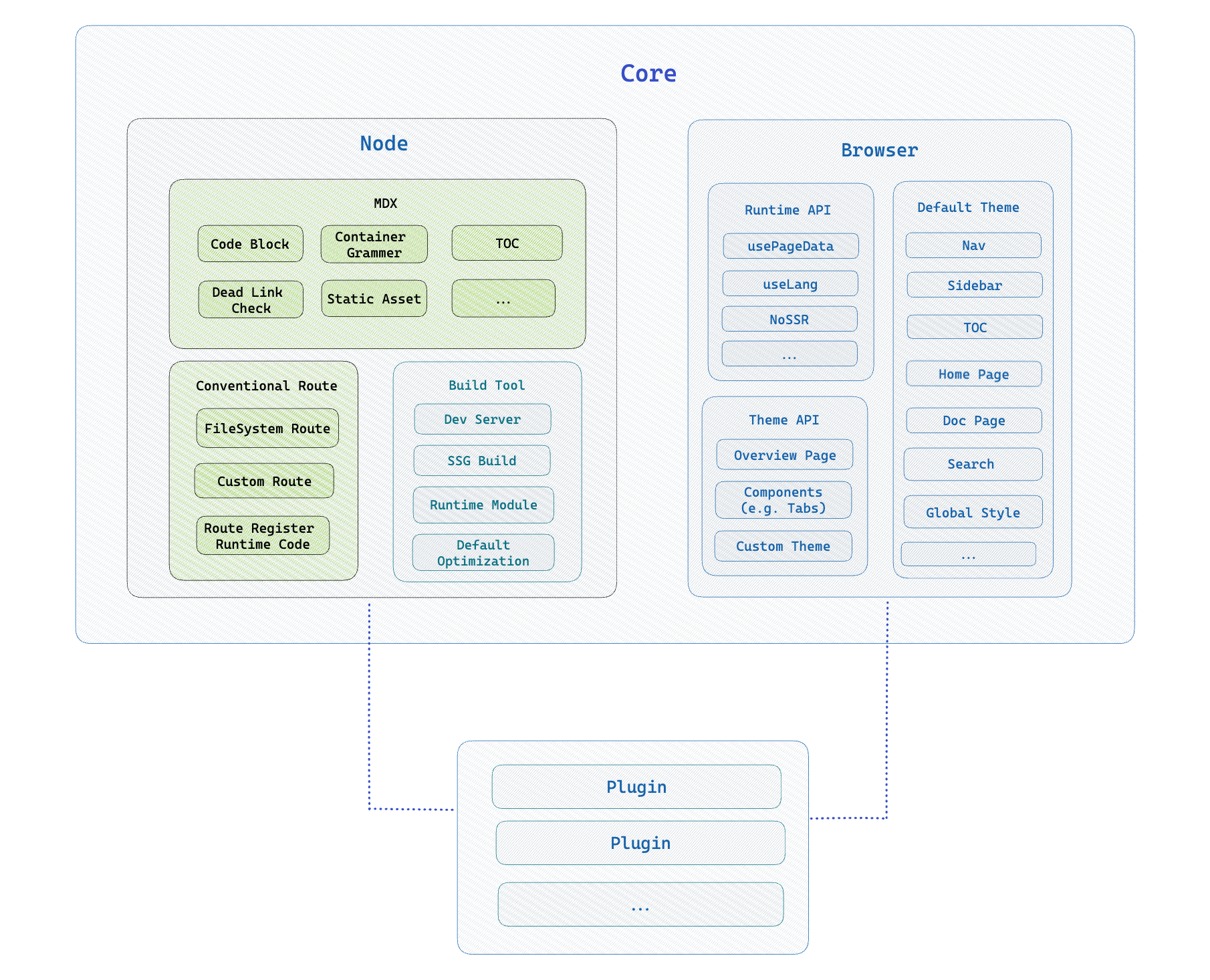 Rspress is divided into two parts: **Node Side** and **Browser Runtime**. Through the plugin system, you can easily extend the abilities of these two parts. Specifically, you can extend the ability to: - [**Markdown/MDX compilation**](/plugin/system/plugin-api#markdown)。You can add [`remark`](https://github.com/remarkjs/remark)/[`rehype`](https://github.com/rehypejs/rehype) plugins to extend the compilation ability of Markdown/MDX. - [**Add custom page**](/plugin/system/plugin-api#addpages). On the basis of Rspress's conventional routing, you can also add new routes through plugins, such as adding a `/blog` route to display a list of blogs, and the content is defined by yourself. - [**Custom build tool behavior**](/plugin/system/plugin-api#builderconfig).In Rspress plugin, you can customize the config of the underlying build tool [Rsbuild](https://rsbuild.rs), and you can also add some Rspack or Rsbuild plugins. - [**Extend page metadata**](/plugin/system/plugin-api#extendpagedata). For each page, some metadata will be calculated inside Rspress, such as `title`, `description`, etc. You can extend the calculation logic of these metadata through plugins, and pass [usePageData](/api/client-api/api-runtime.html#usepagedata) hook access. - Insert some [**custom logic**](/plugin/system/plugin-api#beforebuild/afterbuild) before and after the build process. Such as closing some event listeners after the build process ends. - [**Add global components**](/plugin/system/plugin-api#globaluicomponents). Rspress internally uses React for rendering. You can flexibly extend the runtime page by defining global React components, such as `adding a global BackToTop (return to top) component`, `adding a global side effect logic`. --- url: /plugin/system/write-a-plugin.md --- # Write a plugin Let's inject a global component as an example to see how to define and use plugins. ### 1. Define a plugin ```tsx title="plugin.ts" import type { RspressPlugin } from '@rspress/core'; export function pluginExample(slug: string): RspressPlugin { // Component path, you need to implement the content of the component yourself const componentPath = path.join(__dirname, 'Example.tsx'); return { name: 'plugin-example', // Path to global components globalUIComponents: [componentPath], // Global variable definitions for build phase builderConfig: { source: { define: { 'process.env.SLUG': JSON.stringify(slug), }, }, }, }; } ``` ```tsx title="Example.tsx" import React from 'react'; const Example = () => { console.log(process.env.SLUG); returnExample
;
};
export default Example;
```
A plugin is generally a function that receives some plugin params (optional) and returns an object that contains the name of the plugin and other config.
In the above example, we define a plugin named `plugin-example`, which will define a global environment variable `process.env.SLUG` during the build phase, and inject a global component `Example.tsx` in the document.
### 2. Use a plugin
Register plugins via `plugins` in `rspress.config.ts`:
```tsx title="rspress.config.ts"
import { pluginExample } from './plugin';
export default {
plugins: [pluginExample('test')],
};
```
Then the `Example` component will be injected into the page and we can access the `process.env.SLUG` variable in the component.
---
url: /plugin/system/plugin-api.md
---
# Plugin API
In the previous section, we introduced the basic structure of the plugin. In this section, we will introduce the API of the plugin to help you understand the abilities of the plugin in more detail.
### globalStyles
- **Type**:`string`
It is used to add a global style, and the absolute path of a style file is passed in, and the usage is as follows:
```tsx title="plugin.ts"
import type { RspressPlugin } from '@rspress/core';
import path from 'path';
export function pluginForDoc(): RspressPlugin {
// style path
const stylePath = path.join(__dirname, 'some-style.css');
return {
// plugin name
name: 'plugin-name',
globalStyles: path.join(__dirname, 'global.css'),
};
}
```
For example, if you want to modify the theme color, you can do so by adding a global style:
```css title="global.css"
:root {
--rp-c-brand: #ffa500;
--rp-c-brand-dark: #ffa500;
--rp-c-brand-darker: #c26c1d;
--rp-c-brand-light: #f2a65a;
--rp-c-brand-lighter: #f2a65a;
}
```
### globalUIComponents
- **Type**:`(string | [string, object])[]`
It is used to add global components, passing in an array, each item in the array is the absolute path of a component, the usage is as follows:
```tsx title="plugin.ts"
import type { RspressPlugin } from '@rspress/core';
export function pluginForDoc(): RspressPlugin {
// component path
const componentPath = path.join(__dirname, 'foo.tsx');
return {
// plugin name
name: 'plugin-comp',
// Path to global components
globalUIComponents: [componentPath],
};
}
```
The item of `globalUIComponents` can be a string, which is the path of the component file, or an array, the first item is the path of the component file, and the second item is the component props, for example:
```ts title="rspress.config.ts"
import { defineConfig } from '@rspress/core';
import type { RspressPlugin } from '@rspress/core';
export function pluginForDoc(): RspressPlugin {
// component path
const componentPath = path.join(__dirname, 'foo.tsx');
return {
// plugin name
name: 'plugin-comp',
globalUIComponents: [
[
path.join(__dirname, 'components', 'MyComponent.tsx'),
{
foo: 'bar',
},
],
],
};
}
```
When you register global components, Rspress will automatically render these React components in the theme without manually importing and using them.
Through global components, you can complete many custom functions, such as:
```tsx title="compUi.tsx"
import React from 'react';
// Need a default export
// The props comes from your config
export default function PluginUI(props?: { foo: string }) {
return This is a global layout component
;
}
```
In this way, the content of the component will be rendered in the theme page, such as adding **BackToTop** button.
In the meanwhile, you can also use the global component to register some side effects, such as:
```tsx title="compSideEffect.tsx"
import { useEffect } from 'react';
import { useLocation } from '@rspress/core/runtime';
// Need a default export
export default function PluginSideEffect() {
const { pathname } = useLocation();
useEffect(() => {
// Executed when the component renders for the first time
}, []);
useEffect(() => {
// Executed when the route changes
}, [pathname]);
return null;
}
```
This way, side effects of components are executed in the theme page. For example, some of the following scenarios require side effects:
- Redirect for certain page routes.
- Bind click event on the img tag of the page to implement the image zoom function.
- When the route changes, the PV data of different pages are reported.
- ......
### builderConfig
- **Type**:`RsbuildConfig`
Rspress uses [Rsbuild](https://github.com/web-infra-dev/rsbuild) as the build tool. Rsbuild can be configured through `builderConfig`. For specific configuration options, please refer to [Rsbuild(https://rsbuild.rs/config/).
> Of course, if you want to configure Rspack directly, you can also configure it through `builderConfig.tools.rspack`.
```tsx title="plugin.ts"
import type { RspressPlugin } from '@rspress/core';
export function pluginForDoc(slug: string): RspressPlugin {
return {
name: 'plugin-name',
// Global variable definitions for build phase
builderConfig: {
source: {
define: {
SLUG: JSON.stringify(slug),
},
},
tools: {
rspack(options) {
// Modify rspack config
},
},
},
};
}
```
> See [Build Config](/api/config/config-build) for more details.
### config
- **Type**:`(config: DocConfig, utils: ConfigUtils) => DocConfig | Promise{page.a}
;
}
```
### addPages
- Type: `(config: UserConfig) => AdditionalPage[] | Promise{myData.a}
;
}
```
:::tip TIP
This hook is executed after the `routeGenerated` hook.
:::
---
url: /plugin/official-plugins/overview.md
---
# Overview
## Official plugins
Official plugins include:
- [@rspress/plugin-llms](./llms): Generate [llms.txt](https://llmstxt.org/) related files for your Rspress site, allowing large language models to better understand your documentation site.
- [@rspress/plugin-medium-zoom](./medium-zoom): [medium-zoom](https://github.com/francoischalifour/medium-zoom) plugin, used to zoom in images.
- [@rspress/plugin-client-redirects](./client-redirects):Support client redirects.
- [@rspress/plugin-last-updated](./last-updated): Support for displaying the last update time of the article.
- [@rspress/plugin-typedoc](./typedoc): Integrate [TypeDoc](https://github.com/TypeStrong/typedoc), used to generate API documentation of TS module automatically.
- [@rspress/plugin-api-docgen](./api-docgen): Integrate [react-docgen-typescript](https://github.com/styleguidist/react-docgen-typescript) and [documentation](https://github.com/documentationjs/documentation), used to generate api document description automatically.
- [@rspress/plugin-preview](./preview): Support preview of code blocks in Markdown/MDX.
- [@rspress/plugin-playground](./playground): Provide a real-time playground to preview the code blocks in Markdown/MDX files.
- [@rspress/plugin-rss](./rss):Generate RSS files with [feed](https://github.com/jpmonette/feed) for the document site.
---
url: /plugin/official-plugins/llms.md
---
# @rspress/plugin-llms
```ts
interface LlmsTxt {
name: string;
onTitleGenerate?: (context: {
title: string | undefined;
description: string | undefined;
}) => string;
onLineGenerate?: (page: PageIndexInfo) => string;
onAfterLlmsTxtGenerate?: (llmsTxtContent: string) => string;
}
interface MdFiles {
mdxToMd?: boolean;
remarkPlugins?: PluggableList;
}
interface LlmsFullTxt {
name: string;
}
export interface Options {
llmsTxt?: false | LlmsTxt;
mdFiles?: false | MdFiles;
llmsFullTxt?: false | LlmsFullTxt;
include?: (context: { page: PageIndexInfo }) => boolean;
exclude?: (context: { page: PageIndexInfo }) => boolean;
}
```
- **Default**:
When [internationalization](/guide/default-theme/i18n) is not enabled, the default value is:
```ts
{
llmsTxt: { name: 'llms.txt' },
llmsFullTxt: { name: 'llms-full.txt' },
mdFiles: true
}
```
When [internationalization](/guide/default-theme/i18n) is enabled, it will use [multiple configurations](#group), with the default value being:
```ts
[
{
llmsTxt: { name: 'llms.txt' },
llmsFullTxt: { name: 'llms-full.txt' },
mdFiles: true,
include: ({ page }) => page.lang === config.lang,
},
// Automatically generate other languages based on locales configuration
{
llmsTxt: { name: `${lang}/llms.txt` },
llmsFullTxt: { name: `${lang}/llms-full.txt` },
mdFiles: true,
include: ({ page }) => page.lang === lang,
},
// ...
];
```
### llmsTxt
- **Type**: `false | LlmsTxt`
```ts
import type { PageIndexInfo } from '@rspress/core';
export interface LlmsTxt {
name: string;
onTitleGenerate?: (context: {
title: string | undefined;
description: string | undefined;
}) => string;
onLineGenerate?: (page: PageIndexInfo) => string;
onAfterLlmsTxtGenerate?: (llmsTxtContent: string) => string;
}
```
- **Default**: `{ name: 'llms.txt' }`
Whether to generate the llms.txt file, or to customize the llms.txt file through hooks.
The default format of an llms.txt file is as follows:
```markdown
# {title}
> {description}
## {nav1.title}
- [{page.title}]({ page.routePath }): {page.frontmatter.description}
## {nav2.title}
- [{page.title}]({ page.routePath }): {page.frontmatter.description}
```
You can modify the specified part through hook.
- `onTitleGenerate`: Customize the generated title and description sections.
- `onLineGenerate`: Customize each line of the md file.
- `onAfterLlmsTxtGenerate`: Finally modify the contents of the llms.txt file.
For example:
```ts
pluginLlms({
llmsTxt: {
onTitleGenerate: ({ title, description }) => {
return `# ${title} - llms.txt
> ${description}
Rspress is a static site generator based on Rsbuild and it can generate llms.txt with @rspress/plugin-llms.
`;
},
},
});
```
The corresponding generation results are:
```markdown
# Rspress - llms.txt
> Rsbuild based static site generator
Rspress is a static site generator based on Rsbuild and it can generate llms.txt with @rspress/plugin-llms.
## guide
- [foo](/foo.md)
```
### mdFiles
- **Type**: `false | MdFiles`
```ts
export interface MdFiles {
mdxToMd?: boolean;
remarkPlugins?: PluggableList;
}
```
- **Default**: `{ mdxToMd: false, remarkPlugins: [] }`
Whether to generate a markdown file for the corresponding route. When set to `false`, the markdown file for the corresponding route will not be generated.
#### mdxToMd
- **Type**: `boolean`
- **Default**: `false`
Whether to convert mdx content to md content. If enabled, mdx files will be converted to md files through a set of default strategies, but there may be some information loss.
#### remarkPlugins
- **Type**: `PluggableList`
- **Default**: `[]`
You can pass in custom remark plugins to modify the Markdown content.
### llmsFullTxt
- **Type**: `false | LlmsFullTxt`
```ts
export interface LlmsFullTxt {
name: string;
}
```
- **Default**: `{ name: 'llms-full.txt' }`
Whether to generate the llms-full.txt file, the `llms-full.txt` file will not be generated when set to `false`.
### include
- **Type**: `(context: { page: PageIndexInfo }) => boolean`
Whether to include certain pages when generated, generally used to simplify llms.txt.
- Example:
Generate `llms.txt` and other related files for pages whose language is English only:
```ts
pluginLlms({
llmsTxt: {
name: 'llms.txt',
},
llmsFullTxt: {
name: 'llms-full.txt',
},
include: ({ page }) => {
return page.lang === 'en';
},
});
```
### exclude
- **Type**: `(context: { page: PageIndexInfo }) => boolean`
Whether to exclude certain pages, it will be executed after `include`.
- Example:
Exclude a single page under the `/foo` route:
```ts
pluginLlms({
llmsTxt: {
name: 'llms.txt',
},
llmsFullTxt: {
name: 'llms-full.txt',
},
exclude: ({ page }) => {
return page.routePath === '/foo';
},
});
```
## UI component props
### LlmsCopyButtonProps
- **Type**: `LlmsCopyButtonProps`
```ts
interface LlmsCopyButtonProps
extends React.ButtonHTMLAttributes{pageData.page.lastUpdatedTime}
;
}
```
---
url: /plugin/official-plugins/typedoc.md
---
# @rspress/plugin-typedoc Hello World
;
}
export default App;
```
````
It's worth noting that you need to export the component as default, and Rspress will automatically render this component.
But if you want to keep the style of the code block instead of rendering it as a component, you can add the `pure` identifier to specify, the usage is as follows:
````md
```tsx pure
function App() {
return Hello World
;
}
export default App;
```
````
If you have set `defaultRenderMode` to `'pure'`, Rspress will not render this component by default, but instead display it as a code block. If you want to render a code block as a component in this situation, you can do add the `preview` identifier to specify, the usage is as follows:
````md
```tsx preview
function App() {
return Hello World
;
}
export default App;
```
````
:::tip Tip
Make sure the document ends with `.mdx`.
:::
### External components
In addition to writing component code in the code block of the mdx file, you can also write component code in an external file and then import it in the mdx file through the meta tag of `file="./filename"`. For example
````md title="example.mdx"
```tsx file="./Demo.tsx"
```
````
```tsx title="Demo.tsx"
export default function App() {
return Hello World
;
}
```
External components also need to export the component as default. Through the src attribute of the code tag, you can specify the path of the external component. This plugin supports both relative paths and alias paths(alias).
For some more complex components, this way of using external components will be more convenient.
## Options
This plugin accepts an object parameter of the following type:
```ts
interface PreviewOptions {
previewMode?: 'internal' | 'iframe';
iframeOptions?: IframeOptions;
defaultRenderMode?: 'pure' | 'preview';
}
interface IframeOptions {
framework?: 'react' | 'solid';
position?: 'fixed' | 'follow';
devPort?: number;
}
```
### defaultRenderMode
The default mode of rendering internal code blocks that do not have the `pure` or `preview` identifiers declared by users, defaulting to `preview`.
- `pure`: render as regular code block
- `preview`: render as component
### previewMode
The `previewMode` parameter is used to specify whether the preview mode is internal, defaulting to `internal`. The default mode display effect is as follows:
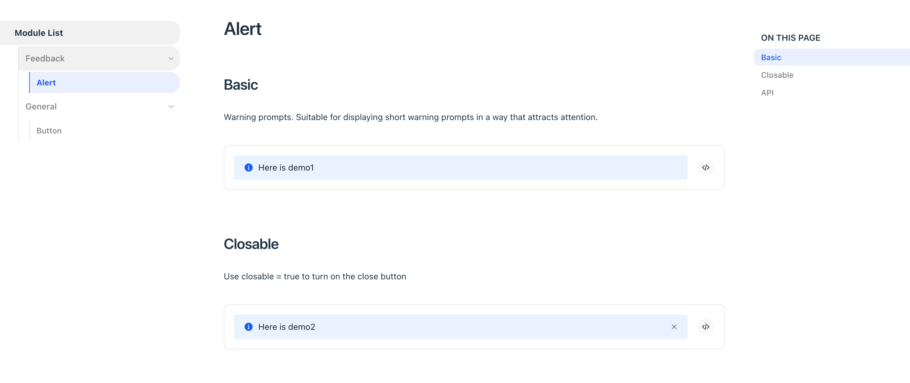
You can also set it for each individual code block:
````md title="example.mdx"
```tsx iframe
function App() {
return Hello World
;
}
export default App;
```
````
````md title="example.mdx"
```tsx file="./demo.tsx" iframe
```
````
If previewMode is `iframe`, you can use the following configuration for the iframe:
### iframeOptions.position
In iframe preview mode, you can use the `iframeOptions.position` parameter to determine the position of the preview area iframe, whether it follows page scrolling (`follow` mode) or is fixed on the page (`fixed` mode), defaulting to `follow`.
The effect of `follow` mode is as follows:
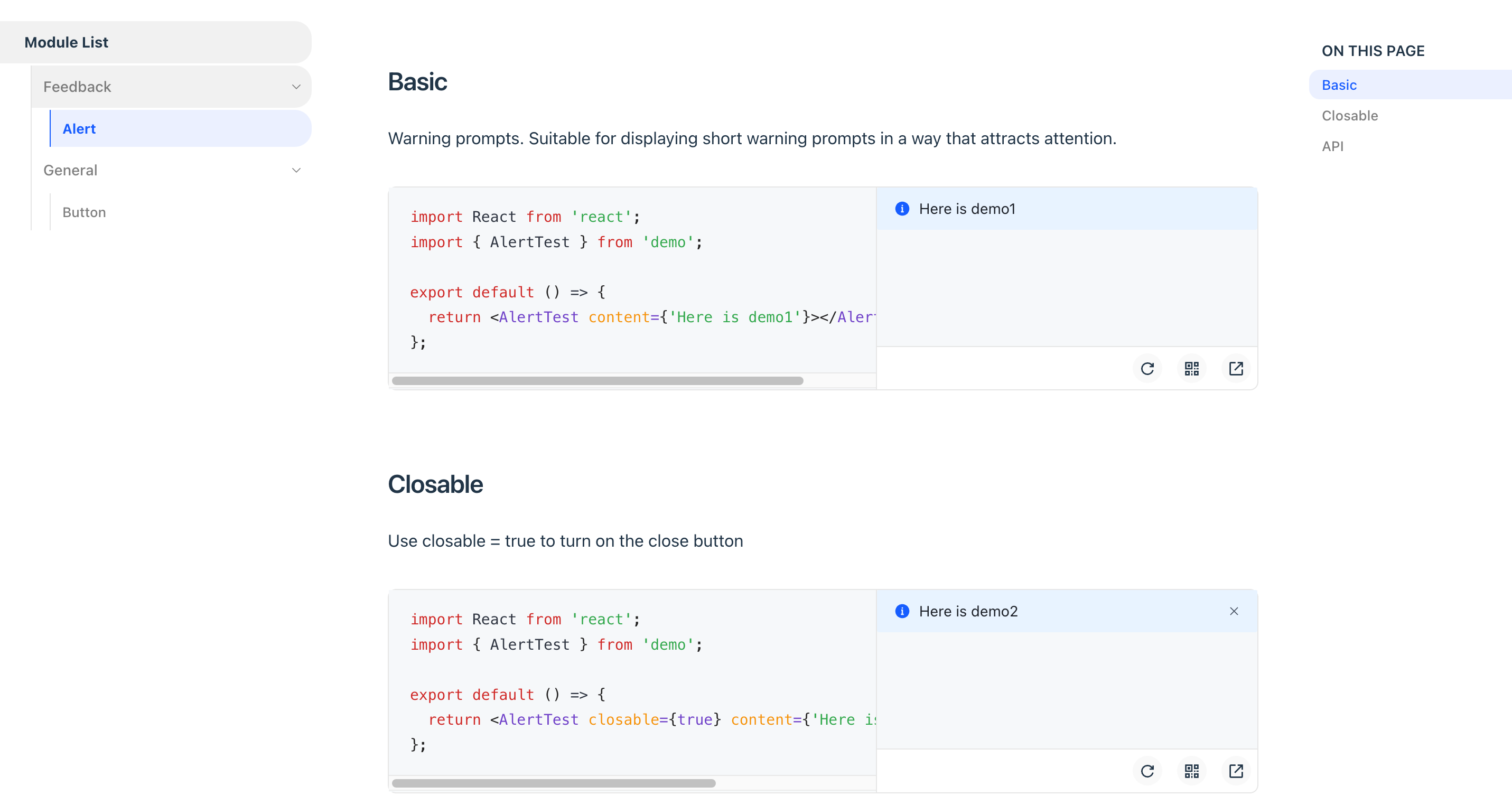
The effect of `fixed` mode is as follows:
### iframeOptions.framework
In iframe preview mode, you can choose the rendering framework, currently supports `react` and `solid`.
### iframeOptions.devPort
In the iframe preview mode, you can configure the dev server port of the preview component.
### iframeOptions.builderConfig
Configure the buildConfig of the iframe, such as adding some global code.
### iframeOptions.customEntry
Configure custom entry to support other `Web` frameworks, such as `Vue`.
Use customEntry only `iframeOptions.position = follow`.
```ts
import { defineConfig } from '@rspress/core';
import { pluginPreview } from '@rspress/plugin-preview';
import { pluginVue } from '@rsbuild/plugin-vue';
export default defineConfig({
// ...
plugins: [
pluginPreview({
previewMode: 'iframe',
previewLanguages: ['vue'],
iframeOptions: {
position: 'follow',
customEntry: ({ entryCssPath, demoPath }) => {
return `
import { createApp } from 'vue';
import App from ${JSON.stringify(demoPath)};
import ${JSON.stringify(entryCssPath)};
createApp(App).mount('#root');
`;
},
builderConfig: {
plugins: [pluginVue()],
},
},
}),
],
});
```
### deprecated: isMobile
From v1.12.0, please use [previewMode](#previewmode) instead.
### deprecated: iframePosition
From v1.12.0, please use [iframeOptions.position](#iframeoptionsposition) instead.
### previewLanguages
- Type: `string[]`
- Default: `['jsx', 'tsx']`
The code languages that support preview, by default jsx and tsx codes are supported. If you need to support other formats of code, such as json/yaml, you can use it in conjunction with the `previewCodeTransform` configuration below.
### previewCodeTransform
- Type: `(codeInfo: { language: string; code: string }) => string`
- default: `({ code }) => code`
Customize the transformation of the code before previewing. For example, if you want to render a piece of JSON Schema through custom transformation logic:
```json
{
"type": "div",
"children": "Render from JSON"
}
```
You can make the following configuration:
```ts
pluginPreview({
// Note to add the default jsx and tsx
previewLanguages: ['jsx', 'tsx', 'json'],
previewCodeTransform(codeInfo) {
if (codeInfo.language === 'json') {
return `
import React from 'react';
const json = ${codeInfo.code};
export default function() {
return React.createElement(json.type, null, json.children);
}
`;
} else {
return codeInfo.code;
}
},
});
```
In this way, the component code after custom logic transformation will be rendered in the end.
:::warning Note
The `previewLanguages` and `previewCodeTransform` configurations only take effect for internal components, that is, they take effect for code blocks declared in mdx files, but they do not take effect for external files declared in `code` tags!
:::
---
url: /plugin/official-plugins/playground.md
---
# @rspress/plugin-playground Hello World
;
}
export default App;
```
````
Otherwise, You can use `direction` parameter to specify the playground layout, `horizontal` and `vertical` are supported:
````mdx
```jsx direction=vertical
import React from 'react';
function App() {
return Hello World
;
}
export default App;
```
````
It's worth noting that you need to export the component as default, and Rspress will automatically render this component.
But if you want to keep the style of the code block instead of rendering it as a component, you can add the `pure` identifier to specify, the usage is as follows:
````mdx
```tsx pure
import React from 'react';
function App() {
return Hello World
;
}
export default App;
```
````
If you have set `defaultRenderMode` to `'pure'`, Rspress will not render this component by default, but instead display it as a code block. If you want to render a code block as a component in this situation, you can do add the `preview` identifier to specify, the usage is as follows:
````mdx
```tsx playground
function App() {
return Hello World
;
}
export default App;
```
````
:::tip Tip
Make sure the document ends with `.mdx`.
:::
### External components
In addition to writing component code in the code block of the mdx file, you can also write component code in an external file and then import it in the mdx file through the meta tag of `file="./filename"`. For example
````md title="example.mdx"
```jsx file="./Demo.jsx"
```
````
```jsx title="Demo.jsx"
import React from 'react';
export default function App() {
return Hello World
;
}
```
Same as internal components, external components also support `direction` attribute:
````md title="example.mdx"
```jsx file="./Demo.jsx" direction=vertical
```
````
External components also need to export the component as default. Through the src attribute of the code tag, you can specify the path of the external component. This plugin supports both relative paths and alias paths(alias).
For some more complex components, this way of using external components will be more convenient.
### Define the layout of the entire page
You can write `playgroundDirection` in frontmatter to define the layout of the editor and preview area in the entire page.
```md title="example.mdx"
---
title: title
playgroundDirection: horizontal
---
```
Priority: Defined directly on the preview area > Page Definition > Configuration.
## Configuration
This plugin accepts an object parameter, the type is as follows:
```ts
interface PlaygroundOptions {
render: string;
include: Array
```ts
export const ZH_LOCALES: Locales = {
zh: {
placeholder: '搜索文档',
translations: {
button: {
buttonText: '搜索',
buttonAriaLabel: '搜索',
},
modal: {
searchBox: {
clearButtonTitle: '清除查询条件',
clearButtonAriaLabel: '清除查询条件',
closeButtonText: '取消',
closeButtonAriaLabel: '取消',
},
startScreen: {
recentSearchesTitle: '搜索历史',
noRecentSearchesText: '没有搜索历史',
saveRecentSearchButtonTitle: '保存至搜索历史',
removeRecentSearchButtonTitle: '从搜索历史中移除',
favoriteSearchesTitle: '收藏',
removeFavoriteSearchButtonTitle: '从收藏中移除',
},
errorScreen: {
titleText: '无法获取结果',
helpText: '你可能需要检查你的网络连接',
},
footer: {
selectText: '选择',
navigateText: '切换',
closeText: '关闭',
poweredByText: '搜索提供者',
},
noResultsScreen: {
noResultsText: '无法找到相关结果',
suggestedQueryText: '你可以尝试查询',
reportMissingResultsText: '你认为该查询应该有结果?',
reportMissingResultsLinkText: '点击反馈',
},
},
},
},
} as const;
```
Rspress provides Chinese translation by default, and you can customize translated text in different languages through `locales`.
- Example:
```tsx
import { Search as PluginAlgoliaSearch, ZH_LOCALES } from '@rspress/plugin-algolia/runtime';
```tsx
new Crawler({
appId: 'YOUR_APP_ID',
apiKey: 'YOUR_API_KEY',
rateLimit: 8,
maxDepth: 10,
startUrls: ['https://rspress.rs'],
sitemaps: ['https://rspress.rs/sitemap.xml'],
discoveryPatterns: ['https://rspress.rs/**'],
actions: [
{
indexName: 'doc_search_rspress_pages',
pathsToMatch: ['https://rspress.rs/**'],
recordExtractor: ({ $, helpers }) => {
const lvl0 =
$('.rspress-nav-menu-item.rspress-nav-menu-item-active')
.first()
.text() || 'Documentation';
return helpers.docsearch({
recordProps: {
lvl0: {
selectors: '',
defaultValue: lvl0,
},
lvl1: '.rspress-doc h1',
lvl2: '.rspress-doc h2',
lvl3: '.rspress-doc h3',
lvl4: '.rspress-doc h4',
lvl5: '.rspress-doc h5',
lvl6: '.rspress-doc pre > code', // if you want to search code blocks, add this line
content: '.rspress-doc p, .rspress-doc li',
},
indexHeadings: true,
aggregateContent: true,
recordVersion: 'v3',
});
},
},
],
initialIndexSettings: {
doc_search_rspress_pages: {
attributesForFaceting: ['type', 'lang'],
attributesToRetrieve: [
'hierarchy',
'content',
'anchor',
'url',
'url_without_anchor',
'type',
],
attributesToHighlight: ['hierarchy', 'content'],
attributesToSnippet: ['content:10'],
camelCaseAttributes: ['hierarchy', 'content'],
searchableAttributes: [
'unordered(hierarchy.lvl0)',
'unordered(hierarchy.lvl1)',
'unordered(hierarchy.lvl2)',
'unordered(hierarchy.lvl3)',
'unordered(hierarchy.lvl4)',
'unordered(hierarchy.lvl5)',
'unordered(hierarchy.lvl6)',
'content',
],
distinct: true,
attributeForDistinct: 'url',
customRanking: [
'desc(weight.pageRank)',
'desc(weight.level)',
'asc(weight.position)',
],
ranking: [
'words',
'filters',
'typo',
'attribute',
'proximity',
'exact',
'custom',
],
highlightPreTag: '',
highlightPostTag: '',
minWordSizefor1Typo: 3,
minWordSizefor2Typos: 7,
allowTyposOnNumericTokens: false,
minProximity: 1,
ignorePlurals: true,
advancedSyntax: true,
attributeCriteriaComputedByMinProximity: true,
removeWordsIfNoResults: 'allOptional',
},
},
});
```
## Distinguish search results based on i18n
You can achieve internationalized search results by combining [Runtime API](/api/client-api/api-runtime) with `docSearchProps`.
Here's an example using `docSearchProps.searchParameters`:
```tsx
// theme/index.tsx
import { useLang } from '@rspress/core/runtime';
import { Search as PluginAlgoliaSearch } from '@rspress/plugin-algolia/runtime';
const Search = () => {
const lang = useLang();
return (
afterHero
}
/* Before home features */
beforeFeatures={beforeFeatures
}
/* After home features */
afterFeatures={afterFeatures
}
/* Before doc footer */
beforeDocFooter={beforeDocFooter
}
/* After doc footer */
afterDocFooter={afterDocFooter
}
/* Doc page front */
beforeDoc={beforeDoc
}
/* Doc page end */
afterDoc={afterDoc
}
/* Doc content front */
beforeDocContent={beforeDocContent
}
/* Doc content end */
afterDocContent={afterDocContent
}
/* Before the nav bar */
beforeNav={beforeNav
}
/* Before the title of the nav bar in the upper left corner */
beforeNavTitle={😄}
/* Nav bar title */
navTitle={Custom Nav Title
}
/* After the title of the nav bar in the upper left corner */
afterNavTitle={afterNavTitle
}
/* The right corner of the nav menu */
afterNavMenu={afterNavMenu
}
/* Above the left sidebar */
beforeSidebar={beforeSidebar
}
/* Below the left sidebar */
afterSidebar={afterSidebar
}
/* Above the right outline column */
beforeOutline={beforeOutline
}
/* Below the outline column on the right */
afterOutline={afterOutline
}
/* Top of the entire page */
top={top
}
/* Bottom of the entire page */
bottom={bottom
}
/* Custom MDX components */
components={{ p: (props) => }}
/>
);
export { Layout };
// re-export
export * from '@rspress/core/theme';
```
### 3. Custom home page and 404 page
In addition to the slot method, if you want to extend the default theme components, you can also customize the Home page components and 404 page components,
as well as other Rspress [built-in components](https://github.com/web-infra-dev/rspress/tree/main/packages/theme-default/src/components)
```tsx title="theme/index.tsx"
import {
Search as BasicSearch,
Layout as BasicLayout,
} from '@rspress/core/theme';
// Custom Home Page
const HomeLayout = () => Home
;
// Custom 404 page
const NotFoundLayout = () => 404
;
// Use slot
const Layout = () => (
Custom Theme Layout
;
}
// The setup function will be called when the page is initialized. It is generally used to monitor global events, and it can be an empty function
const setup = () => {};
// Export Layout component and setup function
export { Layout, setup };
// Export all content of the default theme to ensure that your theme configuration can work properly
export * from '@rspress/core/theme';
```
Layout component will be used to render the layout of the entire document site, you can introduce your custom components in this component, for example:
```tsx
// theme/index.tsx
import { Navbar } from './Navbar';
function Layout() {
return (
Custom Theme Layout
Custom Navbar
;
}
```
So the question is, how does the theme component get the page data and the content of the body MDX component? Next, let's take a look at the related APIs.
### 2. Runtime API
#### usePageData
Get information about all data on the site, such as:
```tsx
import { usePageData } from '@rspress/core/runtime';
function MyComponent() {
const pageData = usePageData();
return {pageData.title}
;
}
```
#### useLang
Get the current language information, such as:
```tsx
import { useLang } from '@rspress/core/runtime';
function MyComponent() {
const lang = useLang();
return {lang}
;
}
```
#### Content
Get MDX component content, such as:
```tsx
import { Content } from '@rspress/core/runtime';
function Layout() {
return (
Current location: {location.pathname}
;
}
```
### 3. Reusing search functionality
The default theme comes with built-in search functionality, which we can break down into two components:
1. The search box, i.e., the entry point to invoke the search.
2. The search panel that pops up after clicking on the search box.
#### Full reuse
If you want to fully reuse the search functionality, you can directly import the `Search` component, like so:
```tsx
import { Search } from '@rspress/core/theme';
function MySearch() {
return Search
;
}
```
Here, `initialized` indicates whether the search is initialized, the `search` method is used to search for keywords, returning a Promise, the result of the Promise is the result of the default full text search.
It should be noted that the `useFullTextSearch` Hook will automatically load the search index during initialization, so you need to first determine the `initialized` status, ensure that initialization is complete, and then call the `search` method.
The type definition of the search method is as follows:
```ts
type SearchFn = (keywords: string, limit?: number) => PromiseThis is a global layout component
;
}
```
In this way, the content of the component will be rendered in the theme page, such as adding **BackToTop** button.
In the meanwhile, you can also use the global component to register some side effects, such as:
```tsx title="compSideEffect.tsx"
import { useEffect } from 'react';
import { useLocation } from '@rspress/core/runtime';
// Need a default export
export default function PluginSideEffect() {
const { pathname } = useLocation();
useEffect(() => {
// Executed when the component renders for the first time
}, []);
useEffect(() => {
// Executed when the route changes
}, [pathname]);
return null;
}
```
This way, side effects of components are executed in the theme page. For example, some of the following scenarios require side effects:
- Redirect for certain page routes.
- Bind click event on the img tag of the page to implement the image zoom function.
- When the route changes, the PV data of different pages are reported.
- ......
## multiVersion
- **Type**: `{ default: string; versions: string[] }`
You can enable multi-version support through the `multiVersion` parameter, for example:
```ts title="rspress.config.ts"
import { defineConfig } from '@rspress/core';
export default defineConfig({
multiVersion: {
default: 'v1',
versions: ['v1', 'v2'],
},
});
```
The `default` parameter is the default version, and the `versions` parameter is the version list.
## route
- **Type**: `Object`
Custom route config.
### route.include
- **Type**: `string[]`
- **Default**: `[]`
Add some extra files in the route. By default, only the files in the document root directory will be included in the route. If you want to add some extra files to the route, you can use this option. For example:
```js
import { defineConfig } from '@rspress/core';
export default defineConfig({
route: {
include: ['other-dir/**/*.{md,mdx}'],
},
});
```
> Note: The strings in the array support glob patterns, the glob expression should be based on the `root` directory of the document, with the corresponding extensions suffix.
:::note
We recommend using [addPages hook](/plugin/system/plugin-api.html#addpages) in a custom Rspress plugin to add some additional files to the route, so that the page route and file path/content can be specified more flexibly and reasonably.
:::
### route.exclude
- **Type**: `string[]`
- **Default**: `[]`
Exclude some files from the route. For example:
```js
import { defineConfig } from '@rspress/core';
export default defineConfig({
route: {
exclude: ['custom.tsx', 'component/**/*'],
},
});
```
> Note: The strings in the array support glob patterns, the glob expression should be based on the `root` directory of the document.
### route.excludeConvention
- **Type**: `string[]`
- **Default**: `['**/_[^_]*']`
A [routing convention](../../guide/use-mdx/components.mdx) set for the convenience of users to use components in the [docs directory](/api/config/config-basic#root), which excludes files starting with `_` by default.
If you really need some routes starting with `_`, you can adjust this rule, for example, set it to exclude only files starting with `_fragment-`:
```js title="rspress.config.ts"
import { defineConfig } from '@rspress/core';
export default defineConfig({
route: {
excludeConvention: ['**/_fragment-*'],
},
});
```
### route.extensions
- **Type**: `string[]`
- **Default**: `['.js', '.jsx', '.ts', '.tsx', '.md', '.mdx']`
The extensions of the files that will be included in the route. By default, Rspress will include all `'js'`, `'jsx'`, `'ts'`, `'tsx'`, `'md'`, `'mdx'` files in the route. If you want to customize the extensions, you can use this option. For example:
```js
import { defineConfig } from '@rspress/core';
export default defineConfig({
route: {
extensions: ['.md', '.mdx'],
},
});
```
### route.cleanUrls
- **Type**: `Boolean`
- **Default**: `false`
Generate url without suffix when `cleanUrls` is `true` for shorter url link.
```js
import { defineConfig } from '@rspress/core';
export default defineConfig({
route: {
cleanUrls: true,
},
});
```
## ssg
- **Type**: `boolean | { experimentalWorker?: boolean; experimentalLoose?: boolean; }`
- **Default**: `true`
Whether to enable static site generation. Rspress enable it by default to generate CSR outputs and SSG outputs.
If your document site is only required to be used in CSR scenarios, you can set `ssg` to `false`, and Rspress will only generate CSR outputs.
```ts title="rspress.config.ts"
import { defineConfig } from '@rspress/core';
export default defineConfig({
ssg: false,
});
```
:::tips
SSG requires the source code to support SSR. If the code is not compatible to SSR, the build process will fail. You can try:
1. Fix code to make it SSR-compatible.
2. Set `ssg: false`, but the SSG feature will be lost.
:::
### experimentalWorker
- **Type**: `boolean`
- **Default**: `false`
After enabled, you can use worker to accelerate the SSG process and reduce memory usage. It is suitable for large document sites and is based on [tinypool](https://github.com/tinylibs/tinypool).
### experimentalExcludeRoutePaths
- **Type**: `(string | RegExp)[]`
- **Default**: `[]`
After enabled, some pages will not be rendered by SSG, and they will directly use html under CSR. This is suitable for SSG errors in large document sites bypassing a small number of pages. It is not recommended to enable this option actively.
## replaceRules
- **Type**: `{ search: string | RegExp; replace: string; }[]`
- **Default**: `[]`
You can set text replacement rules for the entire site through `replaceRules`. The rules will apply to everything including `_meta.json` files, frontmatter configurations, and document content and titles.
```ts title="rspress.config.ts"
export default {
replaceRules: [
{
search: /foo/g,
replace: 'bar',
},
],
};
```
## languageParity
- **Type**: `Object`
Scans the `md` and `mdx` files in the document root directory to detect missing language versions, protect language parity.
### languageParity.enable
- **Type**: `boolean`
- **Default**: `false`
Whether to enable language parity checks.
```ts title="rspress.config.ts"
import { defineConfig } from '@rspress/core';
export default defineConfig({
languageParity: {
enabled: true,
},
});
```
### languageParity.include
- **Type**: `string[]`
- **Default**: `[]`
Specifies the folders to be checked, defaulting to all files in the document root directory. Paths should be relative to each language directory. For example:
```ts title="rspress.config.ts"
import { defineConfig } from '@rspress/core';
export default defineConfig({
languageParity: {
// `posts/foods` and `articles` folders under the zh/en language directories
include: ['posts/foods', 'articles'],
},
});
```
### languageParity.exclude
- **Type**: `string[]`
- **Default**: `[]`
Excludes certain folders and files from the checks.
```ts title="rspress.config.ts"
import { defineConfig } from '@rspress/core';
export default defineConfig({
languageParity: {
exclude: ['excluded-directory', 'articles/secret.md'],
},
});
```
---
url: /api/config/config-theme.md
---
# Theme config
Theme config is located under `themeConfig` in the `doc` param. For example:
```ts title="rspress.config.ts"
import { defineConfig } from '@rspress/core';
export default defineConfig({
themeConfig: {
// ...
},
});
```
## nav
- Type: `Array`
- Default: `[]`
The `nav` configuration is an array of `NavItem` with the following types:
```ts
interface NavItem {
// Navbar text
text: string;
// Navbar link
link: '/';
// Activation rules for navbar links
activeMatch: '^/$|^/';
// svg tag string or image URL(optional)
tag?: string;
}
```
`activeMatch` is used to match the current route, when the route matches the `activeMatch` rule, the nav item will be highlighted. By default, `activeMatch` is the `link` of the nav item.
For example:
```ts title="rspress.config.ts"
import { defineConfig } from '@rspress/core';
export default defineConfig({
themeConfig: {
nav: [
{
text: 'Home',
link: '/',
},
{
text: 'Guide',
link: '/guide/',
},
],
},
});
```
Of course, multi-level menus can also be configured in the `nav` array with the following types:
```ts
interface NavGroup {
text: string;
// submenu
items: NavItem[];
// svg tag string or image URL(optional)
tag?: string;
}
```
For example the following configuration:
```ts title="rspress.config.ts"
import { defineConfig } from '@rspress/core';
export default defineConfig({
themeConfig: {
nav: [
{
text: 'Home',
link: '/',
},
{
text: 'Guide',
items: [
{
text: 'Getting Started',
link: '/guide/getting-started',
},
{
text: 'Advanced',
link: '/guide/advanced',
},
// Also support sub group menu
{
text: 'Group',
items: [
{
text: 'Personal',
link: 'http://example.com/',
},
{
text: 'Company',
link: 'http://example.com/',
},
],
},
],
},
],
},
});
```
## sidebar
- Type: `Object`
The sidebar of the website. The config is an object with the following types:
```ts
// The key is the path of SidebarGroup
// value is an array of SidebarGroup
type Sidebar = RecordThis is a footer with a link and bold text
', }, }, }); ``` ## outline - Type: `boolean` - Default: `true` Whether to show the sidebar in right position. For example: ```ts title="rspress.config.ts" import { defineConfig } from '@rspress/core'; export default defineConfig({ themeConfig: { outline: false, }, }); ``` ## outlineTitle - Type: `string` - Default: 'ON THIS PAGE' Configure the title of the outline in the outline panel. For example: ```ts title="rspress.config.ts" import { defineConfig } from '@rspress/core'; export default defineConfig({ themeConfig: { outlineTitle: 'Outline', }, }); ``` ## lastUpdated - Type: `boolean` - Default: `false` Whether to display the last update time, it is not displayed by default. :::info You need to commit the markdown file to see the updated time. ::: For example: ```ts title="rspress.config.ts" import { defineConfig } from '@rspress/core'; export default defineConfig({ themeConfig: { lastUpdated: true, }, }); ``` ## lastUpdatedText - Type: `string` - Default: `Last Updated` The text of the last update time. For example: ```ts title="rspress.config.ts" import { defineConfig } from '@rspress/core'; export default defineConfig({ themeConfig: { lastUpdatedText: 'Last Updated', }, }); ``` ## prevPageText - Type: `string` - Default: `Previous Page` The text of the previous page. for example: ```ts title="rspress.config.ts" import { defineConfig } from '@rspress/core'; export default defineConfig({ themeConfig: { prevPageText: 'Previous Page', }, }); ``` ## searchPlaceholderText - Type: `string` - Default: `Search` The placeholder text of the search box. For example: ```ts title="rspress.config.ts" import { defineConfig } from '@rspress/core'; export default defineConfig({ themeConfig: { searchPlaceholderText: 'Search', }, }); ``` ## searchNoResultsText - Type: `string` - Default: `No results for` The text of no search result. For example: ```ts title="rspress.config.ts" import { defineConfig } from '@rspress/core'; export default defineConfig({ themeConfig: { searchNoResultsText: 'No results for', }, }); ``` ## searchSuggestedQueryText - Type: `string` - Default: `Please try again with a different keyword` The text of suggested query text when no search result. For example: ```ts title="rspress.config.ts" import { defineConfig } from '@rspress/core'; export default defineConfig({ themeConfig: { searchSuggestedQueryText: 'Please search again', }, }); ``` ## overview - Type: `Object` The config of overview page/component. The config is an object with the following types: ```ts interface FilterConfig { filterNameText?: string; filterPlaceholderText?: string; filterNoResultText?: string; } ``` For example: ```ts title="rspress.config.ts" import { defineConfig } from '@rspress/core'; export default defineConfig({ themeConfig: { overview: { filterNameText: 'Filter', filterPlaceholderText: 'Enter keyword', filterNoResultText: 'No matching API found', }, }, }); ``` ## socialLinks - Type: `Array` - Default: `[]` You can add related links through the following config, such as `github` links, `x` links, etc. Related links support four modes: `link mode` `text mode` `image mode` `dom mode`, for example: ```ts title="rspress.config.ts" import { defineConfig } from '@rspress/core'; export default defineConfig({ themeConfig: { socialLinks: [ { icon: 'github', mode: 'link', content: 'https://github.com/sanyuan0704/island.js', }, { icon: 'wechat', mode: 'text', content: 'wechat: foo', }, { icon: 'qq', mode: 'img', content: '/qrcode.png', }, { icon: 'github', mode: 'dom', content: ' ',
},
],
},
});
```
- When in `link` mode, click the icon to jump to the link.
- When in `text` mode, when the mouse moves over the icon, a pop-up box will be displayed, and the content of the pop-up box is the entered text
- When in the `img` mode, moving the mouse over the icon will display a bullet box, and the content of the bullet box is the specified picture. It should be noted that the picture needs to be placed in the `public` directory.
- When in dom mode, html to render can be passed directly into the content field. Use '' for wrapping
Related links support the following types of images, which can be selected through the icon attribute:
```ts
export type SocialLinkIcon =
| 'lark'
| 'discord'
| 'facebook'
| 'github'
| 'instagram'
| 'linkedin'
| 'slack'
| 'x'
| 'youtube'
| 'wechat'
| 'qq'
| 'juejin'
| 'zhihu'
| 'bilibili'
| 'weibo'
| 'gitlab'
| 'X'
| 'bluesky'
| 'npm'
| { svg: string };
```
If you need to customize the icon, you can pass in an object with `svg attribute`, and the value of svg is the content of the custom icon, for example:
```js
import { defineConfig } from '@rspress/core';
export default defineConfig({
themeConfig: {
socialLinks: [
{
icon: {
svg: '',
},
mode: 'link',
content: 'https://github.com/',
},
],
},
});
```
## nextPageText
- Type: `string`
- Default: `Next Page`
Text for the next page. for example:
```ts title="rspress.config.ts"
import { defineConfig } from '@rspress/core';
export default defineConfig({
themeConfig: {
nextPageText: 'Next Page',
},
});
```
## locales
- Type: `Array
',
},
],
},
});
```
- When in `link` mode, click the icon to jump to the link.
- When in `text` mode, when the mouse moves over the icon, a pop-up box will be displayed, and the content of the pop-up box is the entered text
- When in the `img` mode, moving the mouse over the icon will display a bullet box, and the content of the bullet box is the specified picture. It should be noted that the picture needs to be placed in the `public` directory.
- When in dom mode, html to render can be passed directly into the content field. Use '' for wrapping
Related links support the following types of images, which can be selected through the icon attribute:
```ts
export type SocialLinkIcon =
| 'lark'
| 'discord'
| 'facebook'
| 'github'
| 'instagram'
| 'linkedin'
| 'slack'
| 'x'
| 'youtube'
| 'wechat'
| 'qq'
| 'juejin'
| 'zhihu'
| 'bilibili'
| 'weibo'
| 'gitlab'
| 'X'
| 'bluesky'
| 'npm'
| { svg: string };
```
If you need to customize the icon, you can pass in an object with `svg attribute`, and the value of svg is the content of the custom icon, for example:
```js
import { defineConfig } from '@rspress/core';
export default defineConfig({
themeConfig: {
socialLinks: [
{
icon: {
svg: '',
},
mode: 'link',
content: 'https://github.com/',
},
],
},
});
```
## nextPageText
- Type: `string`
- Default: `Next Page`
Text for the next page. for example:
```ts title="rspress.config.ts"
import { defineConfig } from '@rspress/core';
export default defineConfig({
themeConfig: {
nextPageText: 'Next Page',
},
});
```
## locales
- Type: `Array{pageData.page.title}
;
}
```
## useLang
- **Type:** `() => string`
Get the current language, the return value is a string, which is the current language.
```js
import { useLang } from '@rspress/core/runtime';
function MyComponent() {
const lang = useLang();
// lang === 'zh-CN'
return {lang}
;
}
```
## useVersion
- **Type:** `() => string`
Get the current version, the return value is a string, which is the current version.
```tsx
import { useVersion } from '@rspress/core/runtime';
export default () => {
const version = useVersion();
return Current version: {version}
;
};
```
## useDark
- **Type:** `() => boolean`
Whether it is dark mode currently, the return value is a boolean value.
```js
import { useDark } from '@rspress/core/runtime';
function MyComponent() {
const dark = useDark();
return {dark}
;
}
```
Note that in the SSG process, `useDark` cannot accurately reflect the theme setting of the user's browser, because SSG is executed during the build stage. Only after client hydration is complete, this hook will return the correct theme value.
If you need to apply a dark theme style in the SSG stage, it is recommended to use the CSS selector `.dark` to set the style. Rspress will add the `dark` class name to the root element of the document, which will be effective in both SSG and client:
```css
/* Light mode style */
.my-component {
color: black;
background-color: white;
}
/* Dark mode style */
.dark .my-component {
color: white;
background-color: #1a1a1a;
}
```
## useI18n
Rspress provides `useI18n` this hook to get the internationalized text, the usage is as follows:
```tsx
import { useI18n } from '@rspress/core/runtime';
const MyComponent = () => {
const t = useI18n();
return {t('gettingStarted')}
;
};
```
For better type hinting, you can configure `paths` in tsconfig.json:
```json
{
"compilerOptions": {
"paths": {
"i18n": ["./i18n.json"]
}
}
}
```
Then use it like this in the component:
```tsx
import { useI18n } from '@rspress/core/runtime';
const MyComponent = () => {
const t = useI18n{t('gettingStarted')}
;
};
```
This way you get type hints for all literal keys defined in `i18n.json`.
> See more in [Internationalization](/guide/default-theme/i18n).
## Router hook
Rspress internally uses and re-exports all APIs of `react-router-dom`, you can use it like this:
```ts
import { useLocation } from '@rspress/core/runtime';
function MyComponent() {
const location = useLocation();
return {location.pathname}
;
}
```
---
url: /api/client-api/api-components.md
---
# Built-in components
:::info Note
In order to make it easier for you to use these components, the `rspress/theme` package has been aliased inside Rspress, so you can directly use `@theme` to import these components.
:::
## Badge
The Badge component is used to display a badge. For example:
```tsx title="index.mdx"
import { Badge } from '@theme';
function App() {
// Using text prop
return
Rspress
Rspress
The content here will only be rendered on the client side